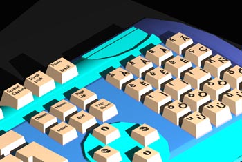
Something with an interesting ‘forcing function’ story has been right in front of me all this time: the QWERTY keyboard, developed by Christopher Sholes and then Remington, with the intention of controlling the user’s behaviour. Until typists became proficient with the QWERTY system, the non-alphabetical layout with deliberate, if arbitrary, separation of common letters allowed the maximum typing speed to be slowed to something approaching writing speed, which reduced the amount of keys sticking and thus benefited both the manufacturer (less product failure, fewer complaints) and the customer (less product failure, less irritation). It also locked users who learned on a Remington QWERTY typewriter into staying with that system (and manufacturer, at least until the patents expired).
Whether or not QWERTY is a real example of market failure (in the sense that it’s an ‘inefficient’ system which nevertheless came to dominate, through self-reinforcing path-dependence, network effects, lock-in, etc), it’s an interesting design example of a commonplace architecture of control where the control function has long become obsolete as the configuration becomes the default way of designing the product.
Would designers today dare to create anything so deliberately idiosyncratic (even if clever) for mass consumption? (Systems that have evolved collaboratively to create complex, powerful results, such as UNIX, probably don’t count here.) The individualistic interfaces of some 1990s modelling software (e.g. Alias StudioTools, Form Z, Lightwave) which required a significant learning investment, were presumably designed with making the user experience easier “once you got used to it” (hence not really architectures of control) but have increasingly fallen by the wayside as the ‘standard’ GUI model has become so commonplace.
Today’s architecture of control is more likely to be something more robust against the user’s adaptation: if for some reason it was desirable to limit the speed at which users typed today, it’s more likely we’d have a keyboard which limited the rate of text input electronically, with a buffer and deliberate delay and no way for the user to learn to get round the system. Indeed, it would probably report the user if he or she tried to do so. Judging by the evidence of the approaches to control through DRM, such a wilfully obstructive design seems more likely.
Returning to the idea of slowing down users for their own benefit, as commenter ‘Apertome’ points out on Squublog:
“One way in which some such designs [i.e. architectures of control] can be GOOD is when mountain biking – a lot of times, they’ll put a tight curve before an obstacle to force you to slow down.”
Note how this is a somewhat different practice to deliberately reducing visibility at junctions: using a bend to slow down a rider before an obstacle does not impede riders who are already travelling at a lower speed, while it makes the higher-speed riders slow down and hence keeps them safe, whereas wilfully removing sightlines at roundabouts would seem in many cases to work to the detriment of drivers who like to assess the road ahead well before the junction, and force all to stop instead.
4 Comments