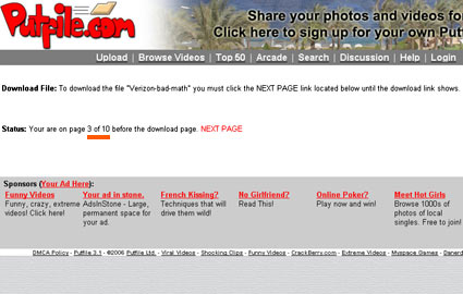
We’ve discussed deliberately splitting up articles to increase page views before – inspired by Jason Kottke – with some very insightful comments, but the technique used by the free file-hosting site Putfile goes way beyond simply inconveniencing the user.
Most free hosting sites require multiple clicks, or a minute’s wait before you can actually download the file you want, but Putfile requires you to click through 10 pages before actually reaching the link to the file (it’s not obvious how to hack it: the filenames change each time).
What makes it rather odd is that the adverts displayed on each of the 10 pages are identical – the same text ads for the same things, in the same order. Am I really more likely to click on one after having looked at multiple instances of it? How positive an incentive is being frustrated?
(It’s possible that the 10 page click-through might be intended to reduce bandwidth use somehow, as if a significant proportion of users will get bored and give up before actually downloading the file. But if users get that bored and antagonistic towards Putfile, they’ll be less likely to click on Putfile links in the future, which means less ad views.)