
A ‘traditional’ museum display cabinet in the Kremlin museum, Moscow. I liked the owl.
Two very interesting posts from last week looked at the use of control in museum design – Frankie Roberto discusses trying to get children (in particular) to learn interactively, and Josh Clark has some thoughts on the way that museum and gallery visitors can be encouraged to think more about the work on display.
Slipping information into play
Frankie – who works for London’s Science Museum – notes the approach of using interactive games or exhibits with forcing functions to (force?-)feed the user information whilst playing: users are “surreptitiously slipped educational information whilst they’re having fun”:
Museums often try to force visitor behaviour in order to achieve learning outcomes, sometimes more successfully than others. A common example of this is a game – designed to appeal to children – which has factual text embedded within it. The ‘Mobile Mayhem’ game included within our recent Dead Ringers exhibition is a typical example. The gameplay, essentially about pressing the right buttons at the right time, is bookended by some factual paragraphs about mobile phone recycling. By revealing the content word by word, and making the screens unskippable until the whole paragraph has been displayed, the player is meant to be forced to read the text, and hence to take in the new and educational information.
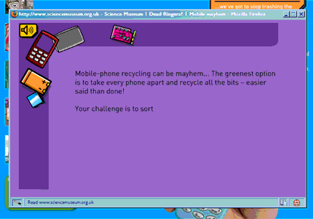
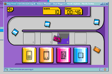
The Mobile Mayhem game, from the Science Museum’s Dead Ringers exhibition website. In the screen shown in the first image, educational text appears word by word, forcing the reader to read it (or at least wait for it to be revealed) before proceeding to the actual game.
The word by word revealing of text is familiar from so many indistinguishable Powerpoint presentations (usually accompanied by that awful typewriter noise, of course), and seeing it used in a ‘control’ context makes me wonder how many speakers/lecturers/managers intentionally (even if subconsciously) reveal their dull text or bullet points word by word so that the audience is forced to stick with the information in the order it’s presented and not read (or think) ahead? I’ve had a few teachers and lecturers in my time who used a bit of paper to cover up parts of OHP transparencies they didn’t want us to read yet, in the hope that we’d pay more attention to what they were saying, and I remember how much that used to irritate me (I like reading ahead!), but I understand why they did it.
Relating back to my recent look at forcing functions in textbooks, Frankie makes the point that:
The problem is, of course, that it’s not that difficult to ignore the education and just focus on the game… it’s pretty impossible for software to actually evaluate educational ‘understanding’, and so attempting to force can be somewhat disingenuous.
[As an aside – and this is something I really should develop in a separate post – there does, equally, come a point where our understanding of how other people understand ideas and concepts makes a one size-fits-all evaluation very difficult. I expect someone has done a study like this (I do hope so – I’d love to read it), but wouldn’t it be fascinating to find out whether certain ways of understanding (or visualising) certain concepts help certain people think laterally and draw conclusions that others have missed? For example, this is Richard Feynman, in ‘It’s as Simple as One, Two, Three’:
When I see equations, I see the letters in colors – I don’t know why. As I’m talking, I see vague pictures of Bessel functions… with light-tan js, slightly violet-bluish ns and dark brown xs flying around. And I wonder what the hell it must look like to the students.
I first noted that quote down a few years ago when reading a collection of Feynman’s essays, as I’d always had the same kind of very mild grapheme-colour synæsthesia that the quote implies, but I wonder whether the phenomenon actually helped Feynman structure mentally and remember mathematical concepts? And can we learn from it in designing educational systems? Anyway, I’ll come back to that idea in a future, more relevant, post!]
Encouraging visitors to think
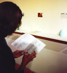
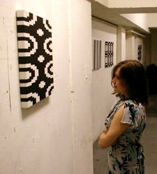
Left: When issued with a booklet explaining artwork on display, many visitors walk around reading this before forming their own impressions of the work. This is an exhibition at Uxbridge’s Beldam Gallery in 2002. Right: Displaying work with no explanatory text, captions or booklets compels visitors to make their own judgments and form their own interpretations of the work (or ignore it, but that’s something of a judgment in itself). This is Dave Cranmer’s Pixelly Paintings at the Foundry, London, in 2002.
Josh’s post argues that many museums and galleries would better fulfil their educational and inspirational potential if they encouraged visitors to think more about what they are looking at, rather than spoon-feeding them information and an ‘established’ opinion – especially pertinent to art:
My wife Ellen is an art historian and a professional museumgoer. She tells me that museum visitors commonly spend more time reading wall texts than looking at the art… It’s a law of interface behavior that users will always follow the path of least resistance. Looking at art is hard. Many find it intimidating, unfamiliar, uncomfortable. It’s easier to read wall text, go shopping or listen to audio commentary than it is to actually face down the work itself.
The interface is broken.
The support materials should be less prominent. What a work “means” or why it’s “important” is second-order information. The important experience is simply to look at the work, to absorb its sensual impact. Respond to it, rather than study it like a schoolbook. For lots of visitors, though, the support materials seem to distract, reducing the time that visitors take to reflect on the works.
The design question: How do you get people to consider the art instead of plunging into its documentation?
As Josh notes, there are designers who think entirely the opposite, and long for more structured lead-ins in galleries, with the artwork’s title and rationale defined clearly up-front. (The always-interesting David Friedman subverts the concept further.)
I can see both points of view. When I was very young I used to get frustrated visiting ‘traditional’ museums that really interested me (mostly motor museums and those with technology) because there was rarely a pre-defined route around them, and I wanted to see everything. When you’re a little kid, zig-zagging across a room from one side to the other to make sure you don’t miss anything out can be difficult, especially when every other visitor is much taller than you and the room seems intimidatingly large. I remember thinking how a museum with displays only along one wall, so that you had to look at them in a certain order, would be good. Now, of course, I would tend to see that as excessive control, and want to be able to miss out things that don’t interest me, and indeed, form my own interpretations of what’s on display.
Josh goes on to give the example of a fairly simple compromise which both allows the visitor to form his or her own interpretations of the work, and to read interpretations if desired:
I think that it would be better to make wall text less prominent, encouraging visitors to spend their time with the art instead.
The modern art museum in Paris, the Centre Pompidou, uses an architecture of control that does just that. Each gallery has a stand with a set of cards offering commentary on the works in the gallery. The wall text is limited only to title, artist and materials. The behavior of museumgoers changes: People walk into the gallery, and spend time with the works. Afterward, those who are curious to learn more go retrieve a card and return to look at the works some more after reading about them.
The educational and background materials are still there, but presented in a way that still encourages people to confront the works first.
It’s interesting that this really does apparently change people’s behavior. (An alternative might be to have more information under a hinged flap on the wall or a pedestal so that only those who want/feel the need to have an established opinion on the piece end up reading it. Or perhaps even the title, artist and materials could be listed under the flap, so that visitors who want to form entirely independent opinions aren’t even swayed by the pieces’ titles or the artists’ names.)
Would you feel cheated if you visited an art gallery and there were no interpretation or explanation of the pieces available at all? Before it became so well-known, how many people picked up The Catcher In the Rye (with its famously sparse blurb-less covers) from a library shelf and put it back, unable to make a commitment to reading it without having an idea what it was about?
Of course, the argument can shift considerably when the subject is a museum dedicated to educating visitors about the exhibits and why they are important, rather than an art gallery, but the principle that Josh outlines of the visitor interfacing (as it were) directly with the exhibit, whether that’s a painting (and the interfacing is figuring out one’s own response to it) or a hands-on science experiment, or anything in between, has a good degree of commonality. The ‘middle man’, the filter of best-fit interpretation drawn up to fit on the standard-size card and fit standard-size opinions, is stripped out.
The Science Museum does a fantastic job of explaining concepts and opening visitors’ eyes to things they actively want to understand, but may never have known how to approach before. It doesn’t tell them how to think about something, but allows them to find out things they didn’t know, and thing more about the things they thought they did know. There is a difference. Bristol’s Exploratory, sadly now closed, was immensely inspirational to me as a child: this was somewhere where all learning was through actual interaction with the (mostly physics-based) exhibits plores.
As we’ve noted before, much of education is about changing behaviour, even if we define the behaviour we want to change as “being ignorant”. Control is one way of attempting to force a change in behaviour, manipulative persuasion is another (thanks Toby) but allowing people to learn because something interests them cuts out the necessity to use force or deceit. If you can make something interesting, you overcome the resistance.