
Following the recent post looking at aspects of casino and slot machine design, in which I quoted William Choi and Antoine Sindhu’s study – “[Casino] carpeting is often purposefully jarring to the eyes, which draws customers’ gaze upwards toward the machines on the gambling floor” – Max Rangeley sends me a link to the Total Influence & Persuasion blog, discussing casinos’ carpeting strategy in more detail:
They don’t want you to look at the floor, they want you to look at the machines!
… after some time you eyes get tired and need a rest. Normally they would be dawn to a area of dull colour that could be used as a “safe haven” (probably all done subconsciously). The ground is normally a good bet, yes?….not in a casino. As soon as you look at the ground it is worse than the machines and your eyes want to move off somewhere else and hopefully toward one of these many waiting, flashing slot machines where you can slot in a few more quid.
Indeed, casinos’ grotesque carpet patterns are apparently fairly notorious – a couple of years ago Boing Boing pointed to this fantastic gallery on Die Is Cast, the website of Dr David G Schwartz, an authority on casino design, strategy, and evolution:
Casino carpet is known as an exercise in deliberate bad taste that somehow encourages people to gamble.
In a strange way, though, it’s s sublime work of art, rivalling any expressionist canvas of the past century. Note the regal tones of Caesars Palace, the bountiful bouquet of Mandalay Place, the soft, almost abstract pointilism of Paris, all whispering, “gamble, gamble” just out of the range of consciousness as people walk to the nearest slot machine.
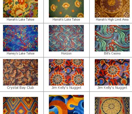
A section of the 9-page gallery of real casino carpet patterns at Die Is Cast.
Implications of this kind of thinking
Are there examples from other fields where graphic design is deliberately used to repel the viewer, specifically in order to shift his or her focus somewhere more desirable?
In newspaper/magazine layout, one might think of company A using deliberately repellent/garish advertising graphics alongside company B’s ad, to shift the reader’s focus away from that page to the opposite page, where company A has a ‘proper’ ad. Or the low-priced items on a menu or on a shelf might be surrounded by ugly/brash/over-busy graphics, so as to make shoppers look away to the area where the higher-priced items are. Maybe even an artist (or the gallery) deliberately positioning ‘ugly’/repellent work either side of the piece which it’s desirable for the visitor to focus on: in comparison, it is bound to look more attractive.
I have no evidence that this happens, but I’m assuming it has been used as a tactic at some point.
Does anyone have any real examples of this?