I’ve mentioned a few times, perhaps more often in presentations than on the blog, the fact that guidelines for the design of pedestrian crossings in the UK [PDF] recommend that where a crossing is staggered, pedestrians should be routed so that they have to face traffic, thus increasing the likelihood of noticing oncoming cars, and indeed of oncoming drivers noticing the pedestrians:
5.2.5 Staggered crossings on two-way roads should have a left handed stagger so that pedestrians on the central refuge are guided to face the approaching traffic stream.
When I gave this example of Design with Intent at Lancaster, the discussion – led, I think, by Lucy Suchman and Patricia Clough – turned to how this arrangement inevitably formalised and reinforced the embedded hegemony of the motor car in society, and so on: that the motorist is privileged over the pedestrian and the pedestrian must submit by watching out for cars, rather than the other way around.
Now, all that is arguably true – I had seen this example as merely a clever, sensible way to use design to influence user behaviour for safety, for everyone’s benefit (both pedestrians and drivers) without it costing any more than, say, a crossing staggered the opposite way round – but this is, maybe, the nature of this whole field of Design with Intent: lots of disciplines potentially have perspectives on it and what it means. What a traffic engineer or an ergonomist or a mistake-proofer sees as a safety measure, a sociologist may see as a designed-in power relation. What Microsoft saw as a tool for helping users was seen as patronising and annoying (at least by the most vociferous users). It’s all interesting, because it all broadens the number of interpretations and considerations applied to everything, and – if I’m honest – force me to think on more levels about every example.
Multiple lenses are helpful to designers otherwise stuck at whatever focal length the client’s prescribed.
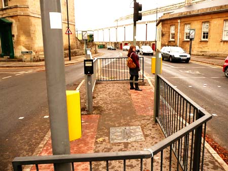
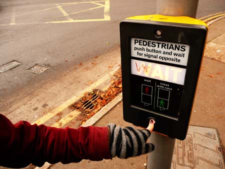
Back to the crossings, though: the above crossing in Bath is a bit unusual in how it’s arranged with so many control panels for pedestrians. But in general, with simple Pelican and Puffin crossings in the UK, there is a design feature even more obvious, which only struck me* the same day I photographed the above crossing in Bath: the pedestrian signal control panel is usually also to the right of where pedestrians stand waiting to cross, i.e. (with UK driving on the left), in order to press the button, pedestrians have to turn to face the oncoming traffic.
The guidelines actually mention this as helping people with poor vision, but it would seem that it really assists all users, even if only slightly. It means you can watch the traffic as you decide whether or not you actually need to press the button, and will be more likely to be standing in a position where you can see the oncoming traffic at the point when you walk out into the road.
5.1.7 To assist blind and partially sighted pedestrians, as they approach the crossing, the primary push button/indicator panel should normally be located on the right hand side. The alignment should encourage them to face oncoming vehicles. The centre of the push button should be between 1.0 and 1.1 metres above the footway level.
This is the sort of ‘hidden’ intentional, strategic design detailing which fascinates me. It is obvious, it is quotidian, but it’s also thoughtful.
*Looking back through my notebooks, I see that someone actually mentioned this to me at a seminar at Sheffield Hallam in September 2007 but I forgot about it: many thanks to whoever it was, and I should be better at reading through my notes next time!
Pingback: Design with Intent | frog design on Design with Intent
Pingback: Design with Intent | Architectural Lens: The Patterns
Pingback: Anonymous