Self-monitoring is one of the most common persuasive techniques used in interface design: basically, giving people feedback on what they’re doing and what they’ve done. There are lots of issues about which kinds of feedback work best, in what circumstances, pairing it with feedforward, i.e. ‘What would happen if I did this?’ information, and so on. My recent long post about smart energy meters looks at some of the ideas within a particular application.
But sometimes it takes an example that’s not at first sight a ‘user interface’ or a ‘product’ to highlight how much difference certain design techniques can make.
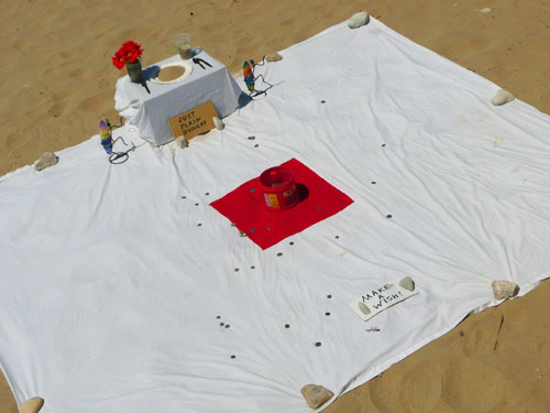 This unattended layout of things on the beach at Santa Barbara, California, soliciting donations, is an interface, too. It’s been designed, cleverly, both to invite passers-by to participate (by throwing coins from an adjacent walkway) and to give them feedback on their throwing ability.
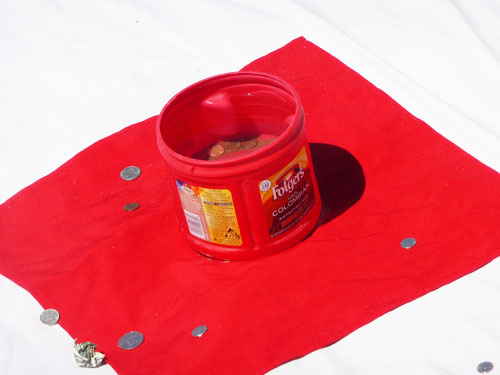
That target – the bright red Folger’s tub on the bright red square of fabric in the middle of the white sheet – is a crucial way of engaging people and getting them to contribute. Who, throwing a coin, isn’t going to try and get it in the tub? (Unless you’re trying to knock over the vases or the little surfers.) And when you miss, you’re going to try again. And again. (I know I did.) You get entertainment and a challenge which seems like it’s worth pursuing, and you can see your track record.
It mustn’t be too difficult. It’s CsÃkszentmihályi’s flow, it’s fairground games theory applied to the simplest of begging sitations, but it works, in terms of getting people to contribute.
What it shows me from a design point of view is that explicitly using targets ought to be included as a Design with Intent technique / pattern in addition to related ones such as self-monitoring, in future versions of the toolkit. The target effect – and other game-related techniques – are sufficiently distinct to inspire plenty of design ideas on their own.
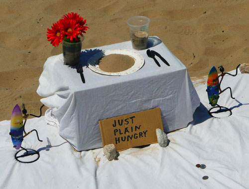
Of course this particular setup also uses a number of other techniques – affective engagement with the ‘Just Plain Hungry’ card, reciprocation with the ‘Make a Wish’ offer, colour & contrast and prominence & visibility with the way the arrangement draws the eye, operant conditioning in terms of a ‘reward’ when you succeed (the wish, or a sense of satisfaction) and social proof in the way that everyone can see that others have thrown coins (and even a note), and that everyone can see you contributing when you throw your coins (or if you decide not to) – a kind of peer surveillance. The plate of sand is an additional affective touch which also works well.
It’s almost like Robert Cialdini put the whole thing together.
It also makes me think it would be worth cataloguing the design techniques employed in the design of charity collecting boxes and games which offer donors (often children) something exciting or engaging in return for their money. I used to love spiral wishing wells and, in general, ones that did something (like this wonderful RSPCA example, though from before my time). There have to be lessons there for other designers interested in engaging users and motivating them to contribute, or behave in a particular way.
I hope whoever set all that up on that beach in Santa Barbara made some money that day. It would have been well deserved.
Pingback: Design with Intent | Learning from game design: 11 gambits for influencing user behaviour
Pingback: Projektowanie perswazyjne – czego możemy nauczyć siÄ™ od twórców gier