by Dan Lockton, Delanie Ricketts, Shruti Aditya Chowdhury (Imaginaries Lab, Carnegie Mellon School of Design) and Chang Hee Lee (Royal College of Art)
Much of how we construct meaning in the real world is qualitative rather than quantitative. We think and act in response to, and in dialogue with, qualities of phenomena, and relationships between them. Yet, quantification has become a default mode for information display, and for interfaces supporting decision-making and behaviour change.
There are more opportunities within design and human-computer interaction for qualitative displays and interfaces, for information presentation, and an aid to help people explore their own thinking and relationships with ideas. Here we attempt one dimension of a tentative classification to support projects exploring opportunities for qualitative displays within design.
This blog post is a slightly edited version of a late-breaking work submission presented at CHI’17, May 06—11, 2017, Denver, CO, USA, and published in the CHI Extended Abstracts at http://dx.doi.org/10.1145/3027063.3053165
Download this article as a PDF.
Introduction
Outside of the digital, we largely live and think and act and feel in response to, and in dialogue with, the perceived qualities of people, things and phenomena, and the relationships between them, rather than their number.
Much of our experience of—and meaning-making in—the real world is qualitative rather than quantitative. How friendly was she? How tired do I feel right now? Who’s the tallest in the group? How windy is it out there? Which route shall we take to work? How was your meal? Which apple looks tastier? Which piece of music best suits the mood? Do I need to use the bathroom? Particularly rarely do we deal with quantities in relation to abstract concepts—two coffees, half a biscuit, three children, but rarely 0.5 loves or 6.8 sadnesses.
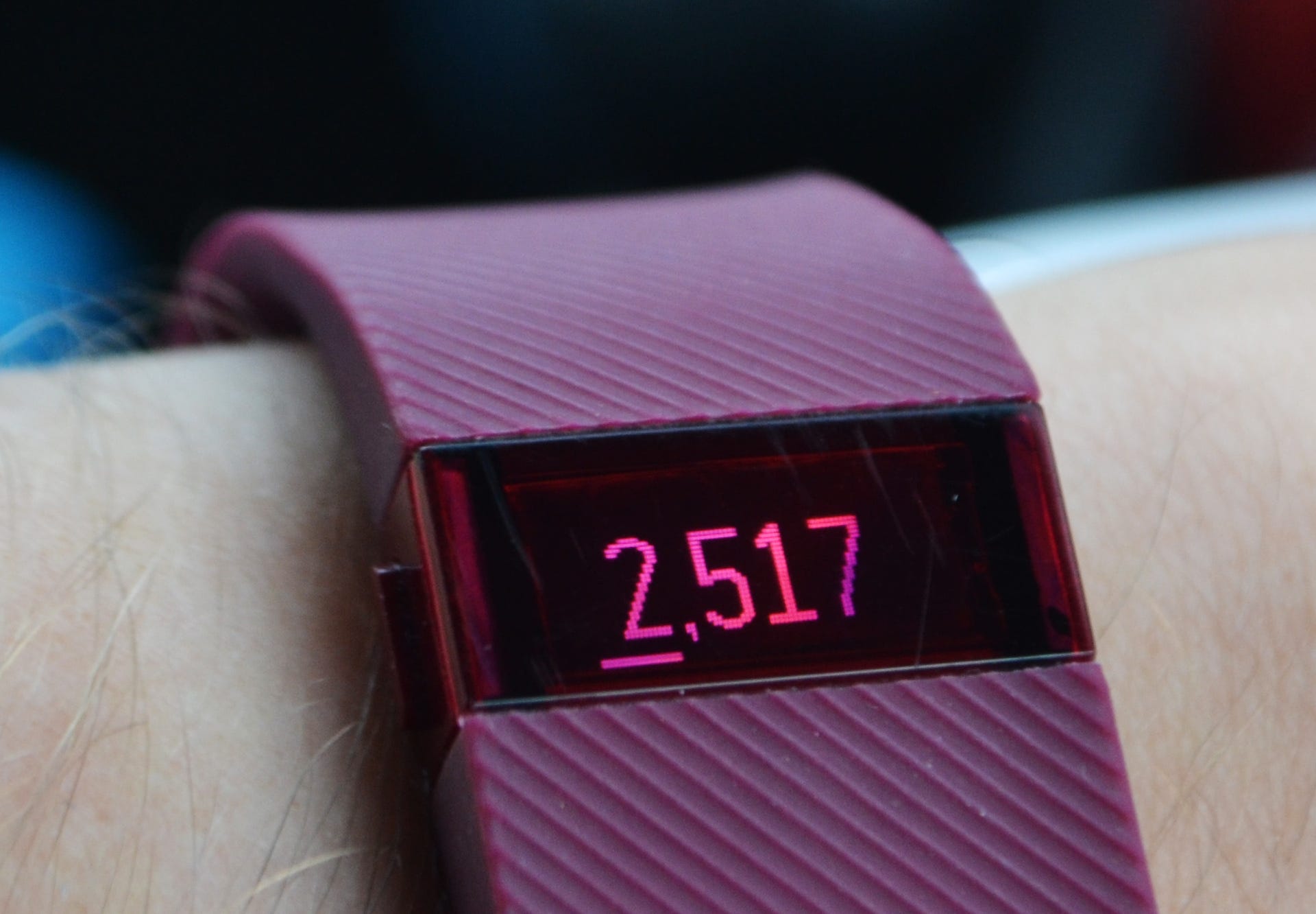
And yet, quantification has become the default mode of interaction with technology, of display of information, and of interfaces which aim to support decision-making and behaviour change in everyday life [27]. We need not elaborate here the phenomena of the quantified self [36, 42] and personal informatics more widely [24, 12], except to note the prevalence of numerical approaches (Figure 1) and the relative unusualness of non-numerical, pattern-based forms (Figure 2).

But what might we be missing through this focus on quantification? It seems as though there might be opportunities for human-computer interaction (HCI) to explore forms of qualitative display and interface, as an approach to information presentation and interaction, as an aid to help people explore their own and each other’s thinking, and specifically to help people understand their relationships and agency with systems.
In this article, we discuss qualitative displays and interfaces, and attempt one dimension of a tentative classification supporting design projects exploring this space.
What could qualitative displays and interfaces be?
Here we define a qualitative display as being a way in which information is presented primarily through representing qualities of phenomena; a qualitative interface enables people to interact with a system through responding to or creating these qualities. ‘Displays’ are not necessarily solely visual—obvious to say, perhaps, but not always made explicit.
Before exploring some examples, we will look at some theoretical issues. The terms ‘qualitative interface’ or ‘qualitative display’ are not commonly used outside of some introductory human factors textbooks, but forms of interface along these lines are found in lots of projects at CHI, TEI, DIS, Ubicomp (all academic human-computer interaction conferences) and other venues, without authors explicitly drawing our attention to the concept—it is perhaps just too obvious and too broad to merit specific comment in HCI and interaction design research. But, assuming the idea does have value, what are some characteristics?
A human face is a qualitative interface, perhaps the earliest we encounter [e.g. 40] along with the voice. We learn to read and interpret emotions in others’ expressions, to recognize commonalities and differences across people, to make inferences about internal and external factors affecting the person, and monitor the effects we or others are having on that person. We understand that the face and voice and our ability to read them are abstractions, interpretations, not perfect knowledge, but a model which enables us to make decisions in conjunction with our reading of our own emotions.
In a sense, the whole world, as we perceive it, is a very complex qualitative interface. The most accurate model of a phenomenon is the phenomenon itself, but it is only useful to us to the extent we can understand what we are observing, detect the patterns we need to, and recognize that we are constructing the ‘reality’ we perceive. We are always creating a model [14] and that model is necessarily not reality itself; all displays of information are representations of a simplified model of phenomena in the world. Levels of indexicality [32], drawing on Charles Peirce’s semiology, are relevant here, addressing the “causal distance” between the phenomenon and how it is displayed.
One advantage of interfaces seeking to provide a qualitative display is that they have the potential to enable the preservation of at least some of the complexity of real phenomena—representing complexity without attenuating variety [2]—even if we do not pay attention to it until we actually need to, in much the same way as certain phenomena in the real world become salient only when we need to deal with them. Looking out of the window or opening the door to see and feel and hear what the weather is like outside presents us with complex phenomena, but we are able to interpret what actions we need to take, in a more experientially salient way than looking at some numbers on a weather app.

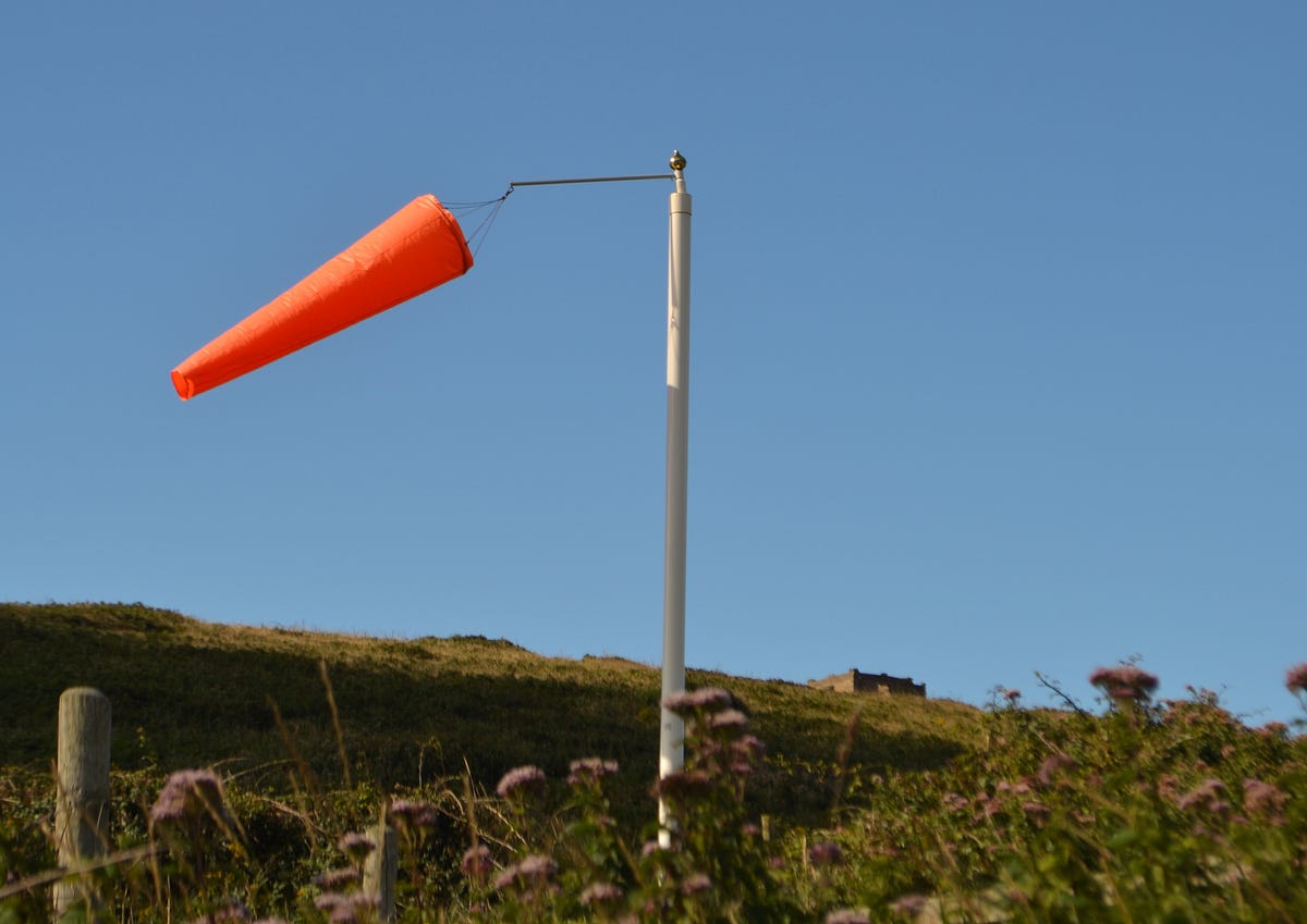
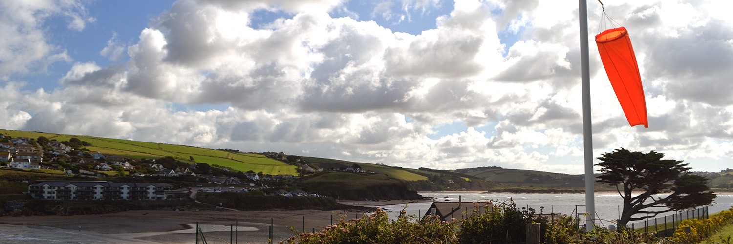
The feel of the wind on our skin, or watching the wind affect the environment, gives us a better sense of whether we need a scarf or coat than knowing the quantitative value of the wind speed and direction (Figures 3, 4 and 5). We can see, hear and feel not just wind speed and direction, but other qualities of it—is it continuous? in short gusts? damp, dry?
Qualitative displays could enable us to learn to recognize patterns in the world (and in data sets), and the characteristics of state changes, similarly to benefits identified in sonification research [35]. We should consider that ‘qualitative’ does not simply imply the absence of numbers. The examples we use in this paper might involve elements that could easily be quantified (rain drops, ink in a pen) but are given meaning through their display in a way that emphasises a quality or characteristic of the phenomenon. We recognise that this is potentially an ambiguous area, and are open to evolving the concept.
A possible spectrum of one dimension of qualitative displays: directness of connection
Here’s a tentative spectrum of one dimension of qualitative displays, relating phenomena to the display in terms of how directly they are connected.
(Levels 0—1 involve direct use of a real-world phenomenon in the display; from about Level 2 up to Level 5, they involve increasing degrees of translation or transduction of the phenomena. This parallels ideas in indexical visualisation [32] and embedded data representation [41] in terms of ‘situatedness’ or causal distance to phenomena.)
- Level 0: The phenomenon itself ‘creates’ the display directly
- Level 1: The display is an ‘accidental’ side-effect of the phenomenon
- Level 2: The side-effect is ‘incorporated’ into a display that gives it meaning
- Level 3: The display is a designed side-effect of the phenomenon
- Level 4: Some minor processing of the phenomenon creates the display
- Level 5: Major processing of the phenomenon creates the display
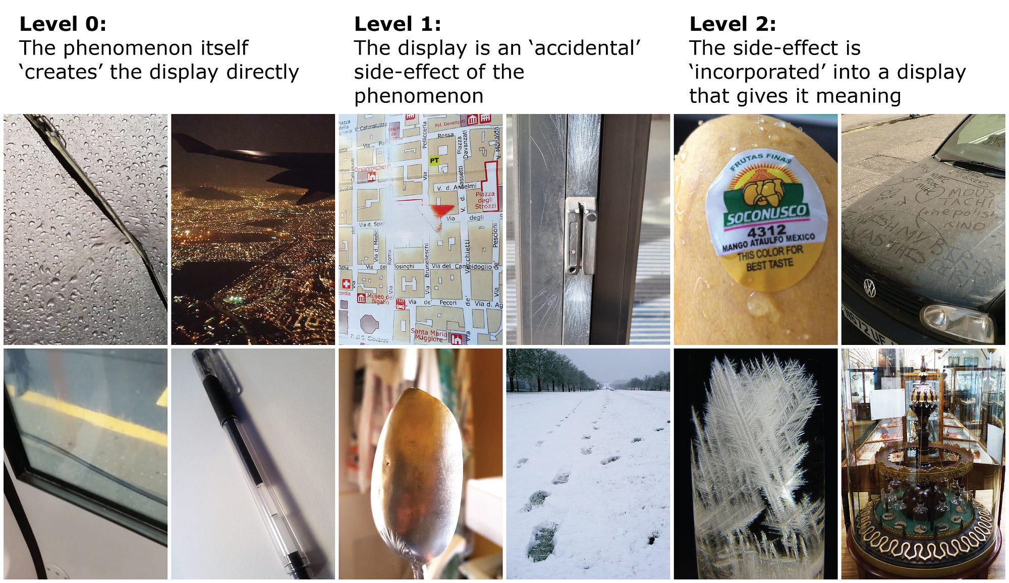
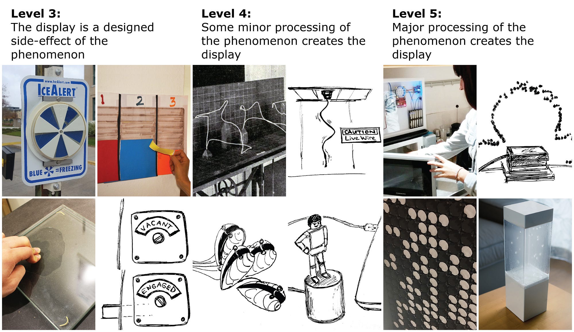
The boundaries between levels here are dependent on observers’ interpretations of what is signified (whether an effect is accidental or deliberate is a common question in design (teleonomy [25])). Nevertheless, this spectrum permits a classification of some examples and is being applied by the authors in undergraduate design studio projects. We note the absence of screen-based examples: this is not intentional, and we welcome adding relevant examples. There are many intersecting research areas we aim to explore; in current HCI research, the most relevant are data physicalisation, embedded data representation, tangible interaction, sonification, and glanceable displays.
The work of Yvonne Jansen, Pierre Dragicevic and others [20] in data physicalisation, including compilation of examples, and embedded data representation [41], provides us with many instances of qualitative display, mostly at what we are calling Levels 2—5; likewise, development of ubiquitous computing, tangible interaction and tangible user interfaces [39, 18, 17] and Hiroshi Ishii’s subsequent vision of tangible bits [19] offers a huge set of projects, many of which provide qualitative interfaces for data or system interaction (usually at Levels 4—5).
Sonification [35] and glanceable displays [e.g. 9, 34] also offer us diverse sets of examples often using non-numerical representation, also largely at levels 4—5. As noted earlier, qualitative does not just mean non-quantitative, and the boundaries may be blurred: if a sonification directly maps numerical values to tones, is it much different to an unlabelled line chart? Or are sparklines [37], for example, a way of turning quantitative data into a form of qualitative presentation?
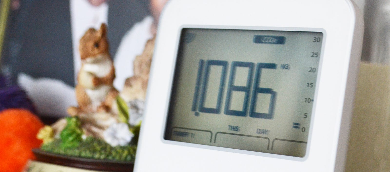
Even with a quantitative display, how a person interprets it may have a qualitative dimension: Figure 8 shows an electricity monitor used by a study participant [28] who accidentally set it to display kg CO2/day equivalent; this “meant nothing” to her but she interpreted the display such that “>1” meant “expensive”. ‘Annotations’ of values as users construct their own meaning [11] may fit here; the aim must, however, be to avoid the kind of reductive ‘qualitative’ nature of a limited set of labels [13].
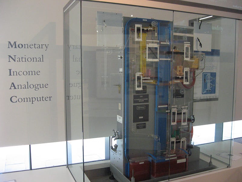
Analogy and metaphor are important here, and the almost-forgotten field of Analogue Computing offers us an intriguing perspective. By “build[ing] models that created a mapping between two physical phenomena” [7], some analogue computers effectively operated as ‘direct’ displays of an analogue of the ‘original’ phenomenon—a kind of meta-level 2 type qualitative display, with devices such as the 1949 Phillips Machine [4] (Figure 9), which performed operations on flows of coloured water to model the economy of a country, enabling an interactive visualization of a system in operation as it operates (there are parallels with Bret Victor and Nicky Case’s work on explorable explanations [38, 8], and the development of visual programming languages).
Other areas of pertinent research and inspiration, are synaesthesia and mental imagery: sensory overlaps, fusions and mappings offer a fertile field for exploring qualitative displays of phenomena.
Conclusion: What use is all of this?
We’re interested in using qualitative displays and interfaces for supporting decision-making, behaviour change and new practices through enabling new forms of understanding—as an aid to help people explore their own and each other’s thinking, and specifically to help people understand their relationships and agency with the systems around them [26]. Projects using qualitative displays are unlikely simply to be de-quantified ‘conversion’ of existing numerical displays; instead, the aim will be to make use of the approach to represent and translate phenomena appropriately, in ways which enable users to construct meaning and afford new ways of understanding, enabling nuance and avoiding reductiveness.
The spectrum of the ‘directness’ dimension introduced here provides a possible starting point for this work, by giving a framework for analysing examples and suggesting ways of handling phenomena to be displayed, and is currently being used by the authors to brief an undergraduate design studio project on materialising environmental phenomena to reveal hidden relationships. We welcome the opportunity to learn from others who have thought about these kinds of ideas to inform our future explorations of this area.
Acknowledgements
Thanks to Dr Delfina Fantini van Ditmar, Dr Laura Ferrarello, Flora Bowden, Gyorgyi Galik, Stacie Rohrbach, Ross Atkin, Shruti Grover, Veronica Ranner and Dixon Lo for discussions in which some of these ideas were formulated and explored, and to the CHI reviewers. Unless otherwise noted, photos are by the authors.
References
1. Timo Arnall. 2014. Exploring ‘immaterials’: Mediating design’s invisible materials. International Journal of Design 8, 2: 101—117. http://www.ijdesign.org/ojs/index.php/IJDesign/article/view/1408
2. W. Ross Ashby. 1956. An Introduction to Cybernetics. Chapman & Hall, London.
3. BERG. 2008. Availabot. Retrieved Jan 10, 2017 from http://berglondon.com/projects/availabot/
4. Chris Bissell. 2007. The Moniac: A Hydromechanical Analog Computer of the 1950s. IEEE Control Systems Magazine 27, 1:59—64. https://dx.doi.org/10.1109/MCS.2007.284511
5. Brian Burns. 2007. From Newness to Useness and Back Again: A review of the role of the user in sustainable product maintenance. Retrieved June 1, 2009 from http://extra.shu.ac.uk/productlife/
 Maintaining%20Products%20presentations/Brian%20Burns.pdf
6. Carbon Arts. 2013. Melbourne Mussel Choir. Retrieved Jan 10, 2017 from http://www.carbonarts.org/projects/melbourne-mussel-choir/
7. Charles Care. 2006—7. A Chronology of Analogue Computing. The Rutherford Journal 2. Retrieved Jan 10, 2017 from http://www.rutherford
 journal.org/article020106.html
8. Nicky Case. 2014. Explorable Explanations. Blog post (Sept 8, 2014). Retrieved Jan 10, 2017 from http://blog.ncase.me/explorable-explanations/
9. Sunny Consolvo, Predrag Klasnja, David W. McDonald, Daniel Avrahami, Jon Froehlich, Louis LeGrand, Ryan Libby, Keith Mosher, and James A. Landay. 2008. Flowers or a Robot Army? Encouraging Awareness & Activity with Personal, Mobile Displays. In Proceedings of 10th International Conference on Ubiquitous Computing (UbiComp’08): 54—63. https://doi.org/10.1145/1409635.1409644
10. Régine Debatty. 2012. The Chronocyclegraph. Blog post, We Make Money Not Art (May 6. 2012). Retrieved Jan 10 2017 from http://we-make-money-not-art.com/the_chronocyclegraph/
11. Paul Dourish. 2004. What we talk about when we talk about context. Personal and Ubiquitous Computing 8, 1: 19—30. http://dx.doi.org/10.1007/
 s00779—003—0253—8
12. Chris Elsden, David Kirk, Mark Selby, and Chris Speed. 2015. Beyond Personal Informatics: Designing for Experiences with Data. In Proceedings of the SIGCHI Conference Extended Abstracts on Human Factors in Computing Systems (CHI EA ’15): 2341—2344. https://dx.doi.org/10.1145/2702613.2702632
13. Delfina Fantini van Ditmar and Dan Lockton. 2016. Taking the Code for a Walk. Interactions 23, 1: 68—71. https://dx.doi.org/10.1145/2855958
14. Heinz von Foerster. 1973. On constructing a reality. In F.E. Preiser (Ed.). Environmental Design Research Vol. 2. Dowden, Hutchinson & Ross, Stroudberg: 35—46. Reprinted in Heinz von Foerster. 2003. Understanding Understanding—Essays on Cybernetics and Cognition. Springer-Verlag, New York: 211—228. https://dx.doi.org/10.1007/0-387-21722-3_8
15. Frank Gilbreth and Lillian Gilbreth. 1917. Applied Motion Study: a collection of papers on the efficient method to industrial preparedness. Sturgis & Walton, New York. Retrieved Jan 10, 2017 from https://archive.org/details/appliedmotionstu00gilbrich
16. Hans Haacke. 2009. Lessons Learned. Tate Papers 12. Retrieved Jan 10, 2017 from http://www.tate.org.uk/download/file/fid/7265
17. Eva Hornecker and Jacob Buur. 2006. Getting a grip on tangible interaction: a framework on physical space and social interaction. In Proceedings of the SIGCHI Conference on Human Factors in Computing Systems (CHI ’06): 437—446. https://dx.doi.org/10.1145/1124772.1124838
18. Hiroshi Ishii and Brygg Ullmer. 1997. Tangible bits: towards seamless interfaces between people, bits and atoms. In Proceedings of the SIGCHI Conference on Human Factors in Computing Systems (CHI ’97): 234—241. https://dx.doi.org/10.1145/258549.258715
19. Hiroshi Ishii, Dávid Lakatos, Leonardo Bonanni, Jean-Baptiste Labrune. 2012. Radical atoms: beyond tangible bits, toward transformable materials. Interactions 19, 1: 38—51. https://dx.doi.org/10.1145/2065327.2065337
20. Yvonne Jansen, Pierre Dragicevic, Petra Isenberg, Jason Alexander, Abhijit Karnik, Johan Kildal, Sriram Subramanian, and Kasper Hornbæk. 2015. Opportunities and Challenges for Data Physicalization. In Proceedings of the SIGCHI Conference on Human Factors in Computing Systems (CHI ’15): 3227—3236. https://dx.doi.org/10.1145/2702123.2702180
21. Ken Kawamoto. 2012. Prototyping “Tempescope”, an ambient weather display. Blog post (Nov 15, 2012). Retrieved Jan 10, 2017 from http://kawalabo.blogspot.jp/2012/11/prototyping-tempescope-ambient-weather.html
22. Lucy Kimbell. 2011. Physical Bar Charts. Retrieved Jan 10, 2017 from http://www.lucykimbell.com/LucyKimbell/PhysicalBarCharts.html
23. David Kirk, David Chatting, Paulina Yurman, and Jo-Anne Bichard. 2016. Ritual Machines I & II: Making Technology at Home. In Proceedings of the SIGCHI Conference on Human Factors in Computing Systems (CHI ’16): 2474—2486. http://dx.doi.org/10.1145/2858036.2858424
24. Ian Li, Anind Dey, and Jodi Forlizzi. 2010. A stage-based model of personal informatics systems. In Proceedings of the SIGCHI Conference on Human Factors in Computing Systems (CHI ’10): 557—566. https://dx.doi.org/10.1145/1753326.1753409
25. Dan Lockton. 2012. POSIWID and Determinism in Design for Behaviour Change. Social Science Research Network. http://dx.doi.org/10.2139/ ssrn.2033231
26. Dan Lockton. 2016. Designing Agency in the City. In Lacey Pipkin (Ed.), The Pursuit of Legible Policy: Agency and Participation in the Complex Systems of the Contemporary Megalopolis. Buró-Buró, Mexico City: 53—61. http://legiblepolicy.info/book/ Legible-Policies_BB.pdf
27. Dan Lockton, David Harrison, and Neville Stanton. 2010. The Design with Intent Method: A design tool for influencing user behaviour. Applied Ergonomics 41, 3: 382—392. http://dx.doi.org/10.1016/ j.apergo.2009.09.001
28. Dan Lockton, Flora Bowden, Catherine Greene, Clare Brass, and Rama Gheerawo. 2013. People and energy: A design-led approach to understanding everyday energy use behaviour. In Proceedings of EPIC 2013: Ethnographic Praxis in Industry Conference: 348—362. https://dx.doi.org/
 10.1111/j.1559—8918.2013.00029.x
29. Dan Lockton, Flora Bowden, Clare Brass, and Rama Gheerawo. 2014. Powerchord: Towards ambient appliance-level electricity use feedback through real-time sonification. In Proceedings of UCAmI 2014: 8th International Conference on Ubiquitous Computing & Ambient Intelligence: 48—51. https://dx.doi.org/10.1007/978-3-319-13102-3_10
30. George Merryweather. 1851. An essay explanatory of the Tempest Prognosticator in the building of the Great Exhibition for the Works of Industry of All Nations. John Churchill, London. Retrieved Jan 10, 2017 from https://archive.org/details/b2804163x
31. Bruno Munari. 1971. Design as Art (trans. Patrick Creagh). Pelican Books, London.
32. Dietmar Offenhuber and Orkan Telhan. 2015. Indexical Visualization—the Data-Less Information Display. In Ulrik Ekman, Jay David Bolter, Lily Diaz, Morten Søndergaard, and Maria Engberg (eds.). Ubiquitous Computing, Complexity and Culture: 288—303. Routledge, New York.
33. Jennifer Payne, Jason Johnson, and Tony Tang. 2015. Exploring Physical Visualization. In Jason Alexander, Yvonne Jansen, Kasper Hornbæk, Johan Kildal and Abhijit Karnik. Exploring the Challenges of Making Data Physical. Proceedings of the SIGCHI Conference Extended Abstracts on Human Factors in Computing Systems (CHI EA ’15): https://architectures.danlockton.co.uk/wp-content/2015-chi2015workshop-physvis.pdf
34. Tim Regan, David Sweeney, John Helmes, Vasillis Vlachokyriakos, Siân Lindley, and Alex Taylor. 2015. Designing Engaging Data in Communities. In Proceedings of the SIGCHI Conference Extended Abstracts on Human Factors in Computing Systems (CHI EA ‘15): 271—274. http://dx.doi.org/
 10.1145/2702613.2725432
35. Stefania Serafin, Karmen Franinovic, Thomas Hermann, Guillaume Lemaitre, Michal Rinott, and Davide Rocchesso. 2011. Sonic Interaction Design. In Thomas Hermann, Andy Hunt, and John Neuhoff (Eds.), The Sonification Handbook. Logos, Berlin: 87—110. http://sonification.de/handbook/ index.php/chapters/chapter5/
36. Melanie Swan. 2013. The quantified self: fundamental disruption in big data science and biological discovery. Big Data 1, 2: 85—99. https://dx.doi.org/10.1089/big.2012.0002
37. Edward Tufte. 2001. The Visual Display of Quantitative Information (2nd ed.). Graphics Press, Cheshire, CT.
38. Bret Victor. 2011. Explorable Explanations. March 10, 2011. Retrieved Jan 10, 2017 from http://worrydream.com/
 ExplorableExplanations
39. Mark Weiser and John Seely Brown. 1995. Designing Calm Technology. Dec 21, 1995. Retrieved Jan 10, 2017 from http://www.ubiq.com/
 weiser/calmtech/calmtech.htm
40. Sherri C. Widen. 2013. Children’s Interpretation of Facial Expressions: The Long Path from Valence-Based to Specific Discrete Categories. Emotion Review 5, 1: 72—77. https://dx.doi.org/10.1177/
 1754073912451492
41. Wesley Willett, Yvonne Jansen, and Pierre Dragicevic. 2017. Embedded Data Representations. IEEE Transactions on Visualization and Computer Graphics 23, 1: 461—470. https://dx.doi.org/10.1109/TVCG.2016.2598608
42. Gary Wolf. 2010. The quantified self. Video (June 2010). Retrieved Jan 10, 2017, from https://www.ted.com/talks/gary_wolf_the_quantified_self
Pingback: Exploring Qualitative Displays and Interfaces – Architectures | EDUMIO.com