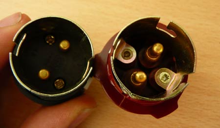
Archive
Bureaucracy

Anti-user seating in Oxford
Top two photos: A bench on Cornmarket Street, Oxford; Lower two photos: A bus stop seat perch on Castle Street.

While from a very narrow specification point-of-view ‘they do their job’, what utter contempt for users these two seating examples demonstrate! The benches on Cornmarket Street are clearly intended to prevent anyone lying down on them (armrests, small radius of curvature) or indeed sitting for very long at all in comfort (height off the ground, vertical backrest, small radius of curvature). Why? Why despise the public so much?

The designer must have been given a specification requiring all the above features: I can’t believe they just arose out of aesthetic or manufacturing considerations. That bench has been engineered to restrict, control and discipline users. Was it really necessary? Does forcing the homeless to lie on the ground instead, or preventing people sitting comfortably and watching the world go by really ‘solve’ any problems?

The bus stop perch – in this particular location intended at least partially for Park & Ride users – is perhaps even worse. It’s angled such that a young child couldn’t easily sit on it without sliding off. An adult has to stretch out his or her legs just to perch. A parent couldn’t sit next to a young child. A shopper would have to put down his or her bags on the ground, since they’d slide off the perch. My girlfriend and I couldn’t rest our drinks on the bench next to us; we had to put them on the ground. OK, that’s not much of a hardship, but it’s just frustrating design, intended to serve objectives other than the users’ benefit or convenience.

You wouldn’t want to wait any longer than necessary at that bus stop. If you were making the decision about whether to drive into Oxford or take the bus to go shopping (assuming cycling not to be an option for this) the unattractiveness of perching at an angle for 15 minutes on that mean strip of perforated sheet would begin to weigh heavily against the public transport option. Sure, you might end up sitting in your car in heavy traffic for 15 minutes, but it’s your car. The seats are comfortable, it’s warm, and you can shape and adjust the environment to suit you.

I don’t want to go off on one here about solving (or easing) Britain’s transport problems, but I do feel that this kind of situation embodies some of the very important issues. By making bus users feel unwanted – despised even – you don’t enhance the image or desirability of the mode of travel. Little details such as this can make a huge difference to perceptions. The buses themselves are great, but if the experience of using the service seems to demonstrate contempt for the user, the user may develop contempt for the service.

Japan may have some of the most explicitly user-unfriendly public benches we’ve come across so far, but there’s also something rather disturbing about the sheer blandness of the bench implementations shown above. Their starkness embodies the thinking behind the design: all possible interaction methods to be reduced down to one sole, pre-defined utility function, with the user not permitted to do anything outside that intentionally myopic definition.

(Incidentally, to be fair, there were some lower seats with horizontal platforms on the other side of the bench in Cornmarket Street. They still had armrests to prevent lying down (or even sitting close to someone), but were not as awful as the curved ones.)

Read More

Thanks to Mr Person at Text Savvy, I’ve just learned that this blog is blocked in China:


Images from the Great Firewall of China test.

I don’t know if that’s good or bad. From a censorship point of view, it’s bad, but it’s certainly interesting to be able to say that the blog’s blocked in China, even if it’s just for a rather prosaic reason (using WordPress?) as Mr Person suggests, and not the incendiary demagoguery contained within these posts and comments.

(Additionally interesting is that as the whole of danlockton.co.uk seems to be blocked, I might not have any more of my portfolio items appearing on Chinese design sites. One site even had me listed alongside Karim Rashid for a while, which was odd and flattering, perhaps, though I don’t think he’ll be losing sleep over it!)

Read More

Johan Strandell kindly lets me know about a discussion of ‘Control vs Communication‘ at 37signals’ Signal vs Noise:

Every once in a while we get an email from a customer asking about how permissions work with our products. They’re almost always asking how to prevent someone from doing something. “How do we prevent someone from posting a message or adding a to-do or downloading a file? How can we make our project site read only except for a select few?”

Simply communicating with people about your expectations of their behavior is often the simplest and most effective solution. It’s respectful, it’s kind, it’s fair. And if someone does something you didn’t want them to do just remind them politely that they weren’t supposed to do that. They’ll almost always get it the second time.

[N]ext time you are looking for more control, consider more communication. It may surprise you.

While the specific context of the discussion is setting permissions, etc, in the Basecamp collaboration software, some of the comments expand the scope to the idea of control and trust within organisations and in society generally – e.g. Neil Wilson comments:

Everybody always wants to try and control behaviour via technical means when by far the most powerful mechanism is via social means.

Read More

All heading the same way

L.J.K. Setright, the late motoring writer and commentator, self-taught mechanical engineer and all-round Renaissance Man, once wrote:

Fashion is a terrible fetter; convention, since it lasts longer, is even worse.

This was in an issue of Car, when it was still any good.

Setright wrote it in reference to car design, and the lack of progress thereof, but I think we can all see how applicable it is to many fields of endeavour, not just in technology but in society also. We should be very wary when fashions become conventions – or at least we should think them through before they become norms. And we should always leave ourselves a way out. (I’ve mentioned this in a few contexts before, perhaps with a little hyperbole.)

What almost became a norm – DRM’d music – is now apparently on the way out. DRM was a fashion, not a convention: still a fetter, but one which can ultimately be shaken off, as it should be.

The great thing about fashions, of course, is that they can be talked into existence, and talked out of existence too. Fashions are not architecture.

Read More

Many of the ‘built environment’ examples discussed here over the last year-and-a-bit have been intended to control (or “manage”) traffic in some way, e.g to slow drivers down, force them to take an alternative route, or force them to stop. I thought it would be worth mentioning a couple of other methods, the rationales behind them, and some of the problems:

Monmouth Thame
Amersham Thaxted
Top row: Monmouth, Monmouthshire and Thame, Oxfordshire; Bottom row: Amersham, Buckinghamshire and Thaxted, Essex. Images from the sites linked.

Historical example: market places

Mediæval market towns commonly had a wide market street, or square, with narrow entrances at the ends, to make it more difficult for animals to escape, and also easier to control when herding them in and out. It may not be immediately obvious from the above photos, but in each of these towns (as with many others where the old layout has been preserved), the market area was, and still is, laid out in this way. It may also have made it more difficult for a thief to escape, since with only a few exit ‘pinch points’, it would make him easier to spot.

This is, of course, almost the opposite rationale to Baron Haussmann’s Paris, with its wide, straight boulevards which prevented effective barricading by revolutionaries and allowed clear lines-of-sight to fire on them.

References: Thaxted at ‘Rural Roads’; History of Thame; Monmouth on Wikipedia.

Pinch point with car overtaking cyclist Pinch point with car overtaking cyclist
Stills from video clips of cars overtaking cyclists at pinch points, from the Cambridge Cycling Campaign website.

Pinch points and other road narrowings

In modern use, pinch points are often installed (along with centre hatching) to force drivers to slow down, usually in built-up areas or at the entrance to them, where there may also be a speed limit change. Sometimes they also force one stream of traffic to stop to allow the other priority, for example when crossing a narrow bridge. Sometimes there are built-out kerbs on both sides of the road; sometimes just a central island; sometimes all three. In general, they prevent drivers overtaking other cars by putting a physical obstruction in the way, even though otherwise it might be legal to overtake. (This is a built environment example of Lessig’s “Code is law” – regardless of what the law might permit or prohibit, it’s the way the system is coded which actually defines what behaviour is possible.)

The problem is that – something which as a driver and a cyclist (and bike designer) I experience a lot – the sudden narrowing of the carriageway causes (forces) drivers to move towards the nearside. And if there’s a cyclist on the nearside, even cycling close to the kerb, he or she will suddenly have a driver passing very close, braking very hard, possibly clipping the bike or actually hitting it. It’s even worse if the kerb is built out as well, since the cyclist has to swerve out into the path of the traffic which may also be swerving in to avoid a central island. In cities such as Cambridge with a lot of cyclists and a lot of traffic, the pinch points are a major problem.

A lot of injuries and deaths have been caused by this ‘safety’ measure. Someone very close to me was knocked off her bike and hurt after swerving onto the kerb to avoid a large truck bearing down on her as the driver tried to fit through a pinch point (similarly to the situation in the photo at the top of Howard Peel’s detailed assessment of pinch points at the Bike Zone). As with so many architectures of control, the designers of these layouts seem to view most users (both drivers and cyclists) as ‘enemies’ who need to be cajoled and coerced into behaving a certain way, without actually looking at what their needs are.

The North Somerset Cycle Campaign’s article on “Good and bad practice” with pinch points shows a far superior layout, for both drives and cyclists (photo reproduced below), from the Netherlands – cycles and cars are kept apart, neither cyclist nor driver is forced to deviate from his/her path, but drivers must give negotiate priority with their oncoming counterparts.

Pinch point in the Netherlands Astonishingly dangerous hatching in Devon
Left: A better pinch point implementation from the Netherlands – image from the North Somerset Cycle Campaign; Right: A very dangerous (and ridiculous) real-world example of hatching-with-obstacles from Devon – image from Richie Graham, discussed in this thread on SABRE

Looking further at centre hatching, this too often causes drivers to pass much too close when overtaking cyclists, since (in the UK), most drivers are reluctant to enter it to overtake even though (with broken lines along the side) they are legally entitled to do so. The reluctance may come from ignorance of the law, but in many cases it is often because there may suddenly be a central concrete island in the middle with no warning. (This is certainly why I’m very careful when using the hatched area to overtake.) Again, this is a de facto imposition of regulation without a legal mechanism enforcing it. As Peter Edwardson puts it:

Two reasons are normally advanced to justify hatched areas, neither of which is entirely convincing. The first is that they separate streams of traffic, but how many head-on collisions occur on single carriageway roads anyway, and surely in the vast majority of cases they involve a driver who has recklessly crossed the white line. The second is that they slow traffic down, which may be true to a limited extent, but again is of no value unless it reduces accidents at the same time…

However, I have recently seen a document from the Highways Agency… that stated clearly that one of the aims of hatched areas was to “deter overtaking”. They daren’t go so far as to actually ban it on straight stretches of road by painting double white lines (although no doubt that will come) but instead they put in confusing paint schemes that have the practical effect of doing just that.

There is of course one entirely sound and legitimate reason for painting hatched areas on the road, to provide a refuge for vehicles turning right, something that in the past has been a major factor in accidents. However such areas should only extend at most for a hundred yards or so on either side of the right turn, and should not be used as an excuse to paint a wide hatched area for a long distance.

In the case of the astonishing (to a UK driver’s eyes) implementation of hatching on the A39 (soon to be A361) Barnstaple southern bypass in Devon – the right-hand photo above – actual bollards have been embedded in the road surface to ‘enforce’ a de facto ‘no overtaking’ intention, though the hatching area actually makes it perfectly legal to overtake. (It makes it worse that the reflectors on the bollards are the wrong colour as well.) Motorcyclists could overtake by weaving between the bollards into the hatched area, but this wouldn’t be especially easy or safe. It would certainly be more dangerous than the alternative situation of wider lanes with no hatching and no bollards. So what’s the point of the scheme?

Shared space at Seven Dials, London Shared space at Seven Dials, London
A Shared Space implementation at Seven Dials in central London, by Hamilton-Baillie Associates

Psychological techniques

We’ve looked before at ‘Shared Space’, ‘naked roads’ and other ‘psychological techniques’ to encourage drivers to be more alert, but Mike Morris sends me a link to this Spiegel story going into more detail and discussing Europe-wide pilot projects:

The utopia has already become a reality in Makkinga, in the Dutch province of Western Frisia. A sign by the entrance to the small town (population 1,000) reads “Verkeersbordvrij” — “free of traffic signs.” Cars bumble unhurriedly over precision-trimmed granite cobblestones. Stop signs and direction signs are nowhere to be seen. There are neither parking meters nor stopping restrictions. There aren’t even any lines painted on the streets.

“The many rules strip us of the most important thing: the ability to be considerate. We’re losing our capacity for socially responsible behavior,” says Dutch traffic guru Hans Monderman, one of the project’s co-founders. “The greater the number of prescriptions, the more people’s sense of personal responsibility dwindles.”

About 70 percent of traffic signs are ignored by drivers. What’s more, the glut of prohibitions is tantamount to treating the driver like a child and it also foments resentment. He may stop in front of the crosswalk, but that only makes him feel justified in preventing pedestrians from crossing the street on every other occasion. Every traffic light baits him with the promise of making it over the crossing while the light is still yellow.

The new traffic model’s advocates believe the only way out of this vicious circle is to give drivers more liberty and encourage them to take responsibility for themselves. They demand streets like those during the Middle Ages, when horse-drawn chariots, handcarts and people scurried about in a completely unregulated fashion.

I think that’s the key to a lot of ‘control-versus-the-user’ debate. Allowing users to take responsibility for their own actions is encouraging them to think. Encouraging people to think is very rarely a bad thing.

One of the simplest consequences of the shared space situations I’ve come across (whether deliberately planned implementations such as at Seven Dials, shown above, or just narrow old streets or village layouts where traffic and pedestrians have always mixed) is that drivers and pedestrians, and drivers and other drivers start to make eye contact with each other to determine who should have priority, or to determine each other’s intentions. Eye contact leads to empathy; empathy leads to respect for other types of road users; respect leads to better understanding of the situation and better handling of similar situations in future. Shared space forces all of us (pedestrians, cyclists and drivers) to try to understand what’s going on from others’ points of view. We learn to grok the situation. And that can’t be bad.

Mike Dickin, the legendary British radio talk-show host who was very sadly killed earlier this week after a heart attack at the wheel, often made the point in his frequent discussions on motoring issues that there should be no need for speed limits in many villages, towns and cities, because in many cases the ‘natural’ limit imposed by pedestrians, other traffic, road layouts and so on, should be enough to slow drivers down to well below the imposed ‘safe’ limits of 20 or 30 mph which lull drivers into a false sense of safety. Of course, he was right, and of course, in most small villages this is still the way things are done, as they were centuries ago, and as Hans Monderman suggests in the above quote.

The age of hyper-regulated behaviour, and treating the user (driver, cyclist, pedestrian) as an idiot incapable of thinking for him or herself, is largely coincident with the age of bureaucratic, centrally planned urban dystopia which sees individuals as components which must all perform identically for the system to operate. I would like to think we can move beyond that view of humanity.

Back to the issue of psychological techniques for traffic management, Jim Lipsey left a comment a couple of months ago mentioning the use of progressively closer painted stripes across the road in Chicago to cause drivers to slow down on a dangerous curve:

In a few weeks, dozens of new pavement stripes will be laid down. At first they’ll be 16-feet apart, but as drivers get closer to the curve, the stripes will only be eight feet apart. “They provide an optical illusion that vehicles are actually speeding up and that causes motorists to slow down, which is of course, the intended effect that we’re trying to have at that location.”

The Chicago example appears to be using only the visual effect to provide the illusion, but a similar technique is often used with raised painted ‘rumble strips’ on the approach to junctions or roundabouts in other countries – e.g. in my (poor) photos below, on the A303 in Somerset, and clearly in this Google Maps image of Ottawa (via this thread).

I remember reading a story once in which someone cycling along an avenue with regularly spaced trees, late one afternoon, had an epileptic fit (I think) as a result of the frequency of the shadow flicker on the road (this is clearly something considered by wind turbine planners [PDF]). Have there been any cases of epilepsy triggered by stripes painted on the road?

Progressively closer rumble strips on the A303 in Somerset Progressively closer rumble strips on the A303 in Somerset
Progressively closer rumble strips on the A303 in Somerset.

Read More

Is Sylvester Stallone Taking Over Your TV?” – anecdotal suggestion that some digital video recorders may be attempting to ‘push’ certain movie franchises in the run-up to release by recording (unrequested) previous titles in a series, or with the same actors.

Well, this is totally impossible to confirm, but we just got a complaint from a reader saying that their DVR was recording Sylvester Stallone movies all on its own. They think this might be some sort of sly promotion tied into the new Rocky movie. Is this happening to anyone else, or do these people have a possessed DVR?

And from the comments:

I have Time Warner in NYC as well, and a month ago Bond movies started automatically queuing up. I thought it was a fluke, but that was right when Casino Royale was hitting wasn’t it? I’m the only person who touches my DVR, so it wasn’t a prank.


Also, in a similar vein to my earlier post on the price structures of ticketing systems, Consumerist reports on US Postal Service stamp vending machines, which require a minimum purchase of $1 (it’s suggested that this is in violation of Visa’s merchant agreements).

While minimum purchase amounts for credit card use are fairly common, (especially with smaller businesses, due to the transaction fees charged by the card company) when a minimum price is imposed on a system such as this stamp vending machine – and only made clear to the user after he or she has already selected the desired item – the practice seems somewhat sneaky. Many people who use a stamp vending machine will do so since they are in a rush, need to send that item of mail, and haven’t got time to wait in a queue. If you only wanted a 39 cent stamp, you’re forced to pay an additional 61 cents (more, in fact, since the stamp face values don’t add up to exactly $1) just to accomplish what you set out to do.

Still, you do get the extra stamp(s) you were ‘forced’ to buy, and at least they don’t go out of date or expire like a bus ticket or a parking ticket.

Read More

@danlockton

Upcoming talks & events

I'm speaking or running workshops at:

Some of my previous presentations

Comments & trackbacks

Blog 2005-date