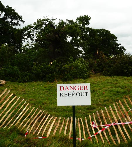
Archive
Communication

HMS Furious
The dazzle painting of HMS Furious, c. 1918. Image from A Gallery of Dazzle-Painted Ships

A couple of weeks ago we looked at casino carpet design – a field where busy, garish graphic design is deliberately employed to repel viewers, and direct their attention somewhere else. Ben Hyde commented that deliberately unattractive “background music, lighting, seating, and color schemes in large malls” may be used to drive shoppers into the quieter surroundings of the actual stores, which certainly rings true in some cases I can think of.

On another level, though, A comment by Kenshi drew my attention to the dazzle camouflage used in the First World War, which is quite startling, in a brilliantly bold way. Roy R Behrens‘ book, False Colors: Art, Design and Modern Camouflage, from the website of which I’ve borrowed these images, looks extremely interesting, and I will certainly be ordering a copy when I have the budget.

Developed in Britain by Norman Wilkinson and in the US by Everett Warner and Frederic Waugh, the dazzle techniques were intended to make “a single thing appear to be a hodgepodge of unrelated components,” as Behrens puts it in this fascinating article. The aim was that such visual disruption would cause confusion and make it difficult for the enemy to identify what kind of ship – and what size – it was from a distance, with the use of ‘reversed perspective’ in the patterning a part of this. The ship’s course – and angle to the viewer – would also be problematic to identify, with colouring including bright whites, blues and sea-green alongside black, darker blue and grey selectively helping parts of the ship to blend into the seascape, and other parts very much stand out.

Breaking the enemy’s ability to distinguish elements of the ship properly, and generally to cause distraction and make it difficult to concentrate on observation for protracted periods, were all part of this plan; painting ships with different dazzle patterning on each side made identification even harder.

Despite being likened to Cubism disdainfully by some contemporary journalists, the processes used for designing the camouflage were developed both analytically and empirically, and extensively tested before being applied to the real vessels. Nevertheless, there are certainly elements in common between dazzle techniques and parts of Picasso’s and others’ work; Behrens has written further on the interactions between Cubism, Gestalt theory and camouflage (both in nature and man-made).

From A Gallery of Dazzle-Painted ShipsFrom A Gallery of Dazzle-Painted Ships
Left: The Mauritania in dazzle paint camouflage. Right: Those blue and white stripes are familiar to UK shoppers today. Images from A Gallery of Dazzle-Painted Ships

Intriguingly, the right-hand image above, with the bold blue and white stripes, has something in common with an everyday livery familiar to tens of millions of British shoppers: the iconic Tesco Value branding (below), at least in its original form. I’m not suggesting an actual link, but as we will see, there is something in common in the intentions behind these disparate methods of influencing viewer behaviour.

Image from Plap man
Tesco Value Beans. Image from Plap man on Flickr.

The same Tim Harford article quoted in my recent post about defaults suggests that the “infamously ugly” Tesco Value packaging is intended as a tool to facilitate price discrimination:

The difficulty is that if some of your products are cheap, you may lose money from customers who would willingly have paid more. So, businesses try to discourage their more lavish customers from trading down by making their cheap products look or sound unattractive, or, in the case of Starbucks, making the cheap product invisible. The British supermarket Tesco has a “value” line of products with infamously ugly packaging, not because good designers are unavailable but because the supermarket wants to scare away customers [from the Value products] who would willingly spend more [on other brands, or Tesco's 'normal' private label products].

Whereas the dazzle camouflage was intended to confuse and disconcert the viewer, the thinking behind the Tesco Value graphics (I would love to know who designed the original style) thus appears to be to disconcert or repel certain viewers (customers) so that they pick a higher-priced alternative (usually on the shelf just above the Value items – Tesco’s planograms have thinking behind them), while allowing immediate segmentation – those customers looking for the cheapest products possible find the Value products easily.

There can’t be many retail situations where pretty much the same products can be sold successfully at two different prices on the same shelving unit just because of differing packaging graphics, but it seems to work for Tesco, in the process creating a significant meme.

Image from B3ta threadImage from Boakes
Left: a ‘Tesco Value’ tattoo, from this B3ta thread There have been many others. Right: Rich Boakes’ ‘Tesco Value’ greetings cards have been widely imitated, and could even have inspired this effort from Asda.

Updates to the Tesco Value branding in recent years have reduced the intensity of the blue stripes and brought the style closer to other supermarkets’ ‘value’ brands, which all tend to be similarly sparse (e.g. Sainsbury’s Basics, below), but the Tesco style is still the most distinctive.

Adequate biscuits

Read More


This is brilliant. Chloë Coulson, Erland Banggren and Ben Williams, three Ravensbourne graduates, have put together a project looking at the “culture of fear”, the media’s use of this, and how it affects our everyday state of mind.

The outcome is a catalogue, WellBeings™ [PDF link] accompanying a specially printed newspaper, The Messenger, designed to be used with special rose-tinted spectacles – simple, yet very clever:

Feeling brave? Read the paper as usual. Feeling fragile? Put on the rose-tinted spectacles to block out the bad news stories which are printed in the same hue as the lenses so it becomes invisible.

The products in the catalogue cater for people made increasingly paranoid by aspects of modern society, by ‘normalising’ paranoia – ranging from H-ear-Phones which allow you to hear what others are saying about you, to Rear-View Mirror spectacles to allow you to keep an eye on who might be following you. As Chloë puts it:

The whole project is about questioning attitudes – should we live in fear – are we safer that way, or should we live for now and not worry about what could happen.

There are also a couple of products in there which are actually defensive weapons – a pepper spray disguised as a perfume atomiser, and house-key-cum-knuckleduster, and these seem to go beyond mere paranoia. All of these products are very plausible, and indeed, some of them are probably commercially viable. Whilst none of these is an architecture of control as such, I felt that they deserved inclusion here – pertinent to the sousveillance discussion, and also the idea of users turning products against instrusive aspects of society, from relatively simple items such as the Knee Defender (prevent the person in front of you on an aircraft reclining his or her seat) to Limor Fried’s Design Noir work on using electronic devices to create social defence mechanisms.

Equally – while perhaps not the focus of the project – the rose-tinted spectacles idea parallels closely the phenomenon of increasing self-selection of the news we expose ourselves to, as the internet and hundreds of TV channels allow segmentation like never before. The idea of a newspaper bringing readers only ‘good’ news has been tried a number of times (a recent example one-off) and has inspired some interesting pieces, but modern media permits many more coloured filters than simply rose-tinting. Clearly, to a large extent, deliberate use of this segmentation can permit intentional reinforcement, entrenchment, even inspiration of certain views and behaviours. Self-selected exposure to propaganda is a curious phenomenon, but one with enormous power.

Read More

Thanks to Mr Person at Text Savvy, I’ve just learned that this blog is blocked in China:


Images from the Great Firewall of China test.

I don’t know if that’s good or bad. From a censorship point of view, it’s bad, but it’s certainly interesting to be able to say that the blog’s blocked in China, even if it’s just for a rather prosaic reason (using WordPress?) as Mr Person suggests, and not the incendiary demagoguery contained within these posts and comments.

(Additionally interesting is that as the whole of danlockton.co.uk seems to be blocked, I might not have any more of my portfolio items appearing on Chinese design sites. One site even had me listed alongside Karim Rashid for a while, which was odd and flattering, perhaps, though I don’t think he’ll be losing sleep over it!)

Read More

Johan Strandell kindly lets me know about a discussion of ‘Control vs Communication‘ at 37signals’ Signal vs Noise:

Every once in a while we get an email from a customer asking about how permissions work with our products. They’re almost always asking how to prevent someone from doing something. “How do we prevent someone from posting a message or adding a to-do or downloading a file? How can we make our project site read only except for a select few?”

Simply communicating with people about your expectations of their behavior is often the simplest and most effective solution. It’s respectful, it’s kind, it’s fair. And if someone does something you didn’t want them to do just remind them politely that they weren’t supposed to do that. They’ll almost always get it the second time.

[N]ext time you are looking for more control, consider more communication. It may surprise you.

While the specific context of the discussion is setting permissions, etc, in the Basecamp collaboration software, some of the comments expand the scope to the idea of control and trust within organisations and in society generally – e.g. Neil Wilson comments:

Everybody always wants to try and control behaviour via technical means when by far the most powerful mechanism is via social means.

Read More

@danlockton

Error: Twitter did not respond. Please wait a few minutes and refresh this page.

Upcoming talks & events

I'm speaking or running workshops at:

Some of my previous presentations

Comments & trackbacks

Blog 2005-date