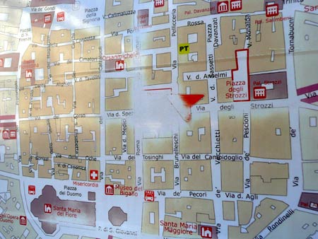
Who really needs a “You Are Here” marker when other visitors’ fingers have done the work for you?
(Above, in Florence; below, in San Francisco)
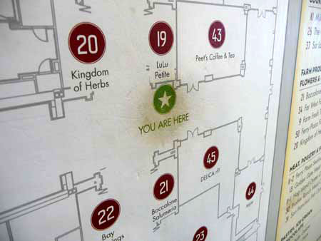
Use-marks, like desire paths, are a kind of emergent behaviour record of previous users’ perceptions (and perceived affordances), intentions, behaviours and preferences. (As Google’s search history is a database of intentions.)
Indeed, while we’d probably expect the “You Are Here” spot to be worn (so it’s not telling us anything especially new) can we perhaps think of use-marks / desire paths as being a physical equivalent of revealed preferences? (Carl Myhill almost makes this point in this great paper [PDF].)
And (I have to ask), to what extent does the presence of wear and use-marks by previous users influence the use decisions and behaviour of new users (social proof)? If you see a well-trodden path, do you follow it? Do you pick a dog-eared library book to read because it is presumably more interesting than the ones that have never been read? What about where you’re confused by a new interface on, say, a ticket machine? Can you pick it up more quickly by (consciously or otherwise) observing how others have worn or deformed it through prior use?
Can we design public products / systems / services which intentionally wear to give cues to future users? How (other than “Most read stories today”) can we apply this digitally?