What comes to your mind if we talk about maintenance? As Naomi Turner points out, the pandemic has in some ways made what was often “invisible” labour much more visible: people’s care for—and repair of—the systems around us (and each other) has been central to maintaining as much as possible of a functioning society even amidst pain and fear. Yet maintenance is still often an unglamorous thing—and rarely thought of from a design perspective. It’s an often overlooked component of sustainability, as well as so many areas of our everyday lives, from health and wellbeing to the ways we travel (or not), work, and live.
Over Septembe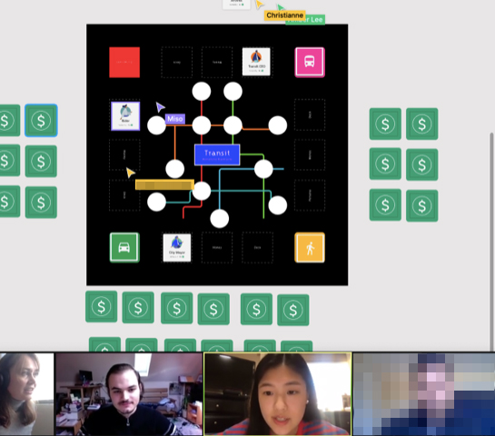 r–October 2020, a group of students from the Imaginaries Lab: Research Through Design class at Carnegie Mellon explored ways to investigate people’s thinking around maintenance in a broad sense, across a variety of areas from public transportation to digital archiving to sustainable lifestyle choices. Julia Cambre, Matt Nam, Miso Demko, Michelle Wang, Christianne Francovich, Amber Lee, and Saumya Sharma developed creative “(in)tangible thinking” methods which could be run online (largely using Miro and Figma, but also coded by students themselves), with some input along the way from experts working on the subject in different ways: Naomi Turner and Dr Laura James from Maintain / the Festival of Maintenance, Dr Nazl? Terzio?lu Özkan from Linköping University, and Cayla Key, Mozilla Foundation fellow at Northumbria University. Although maintenance was the topic, we were also focusing on developing (online) methods for investigating how people think about or understand things, and so the ways the projects resolved are probably as much about this as about the specifics of maintenance itself. (Much as I would have loved to do a class about actual ‘design for maintenance’, this was something different: an exploration of how people think about maintenance.) We’re grateful to be supported in this project by the Frank-Ratchye STUDIO for Creative Inquiry.
At the end of October, we ran an online event with around 35 visitors from the US and Europe where people could try out the activities the students created, and the students gathered experiences from people. At present we are working on taking some of the activities further and writing them up for an academic conference.
In the meantime, though, here are the projects:
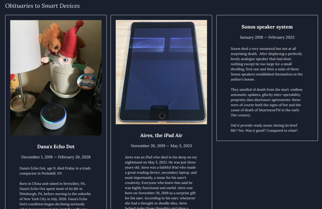
Julia Cambre‘s project Morbid Methods examined maintenance, repair, and the ends-of-life of ‘smart’ devices such as voice assistants, phones, and IoT devices—”what will happen to our smart devices over the long term? And m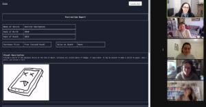 ore specifically, how might people conceive of the maintenance and lifecycle of these smart devices, and how might this differ from how they might behave towards conventional or non-smart devices?” The Morbid Methods obituaries, eulogies, and postmortems created by participants paint pictures of devices often protected and looked after by owners, but assumed to have ‘died’ often through software failure, updates not working, or simply displacement by newer models.
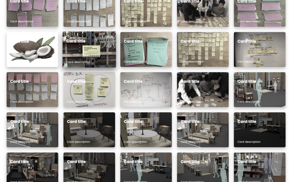
Matthew Nam looked at personal digital archiving, a way of maintaining memories for ourselves amidst the huge explosion in data we generate about our lives. His tool as demonstrated in the online event prompted people to find significance in the images (and thumbnails generated) in a folder they hadn’t looked at for a long time, via suggesting that each image be labelled with a title and a description, as if it were part of a card deck. A subtle colour shift was an additional prompt to consider the images as ‘historic’ within one’s own life.
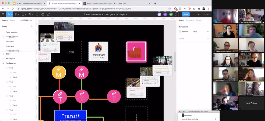
Amber Lee, Christianne Francovich, and Miso Demko took on questions around understandings of transport system maintenance—a large and complex topic. Through designing and testing a multi-player board game in Figma, with an objective of “building” a well-maintained system, with roles such as rider (passenger), activist, transit system CEO, or city mayor (requires a card deck plugin for Figma to experience it), the team aimed both to explore how people understand the system, through how they played, and to use the game to educate players about “the different factors, stakeholders and trade-offs that exist in system maintenance”.
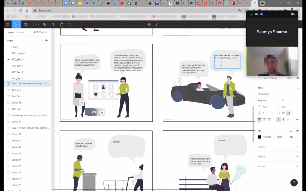
Saumya Sharma explored the idea of maintaining a (more) sustainable lifestyle—what are the many small decisions that must be made when prompted with different choices in everyday situations? Her Lasting Lifestyles activity (via a Figma board) asked participants to reflect on their current behaviours and practices, and then—taking inspiration from Adam Dant’s Modern Life Frustrations Test—placed them in different scenarios with conversations between two or more people around a sustainability-related choice, and prompted them to respond.

Michelle (Wanqiao) Wang examined how we maintain our digital workspaces, with a combination of both physical modelling, and 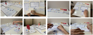 a digital exercise, which looked at the patterns of people switching their focus among multiple devices/screens, and the reasons behind it. Michelle was interested in how people maintain information across working scenarios, and how the information flows among devices.
We also made use of our group of online participants to dig deeper into some of the metaphors commonly used around maintenance, and tried to come up with some alternatives, using a Google Slides version of the New Metaphors cards. Groups explored some alternative metaphors as inspirations, including (a selection):
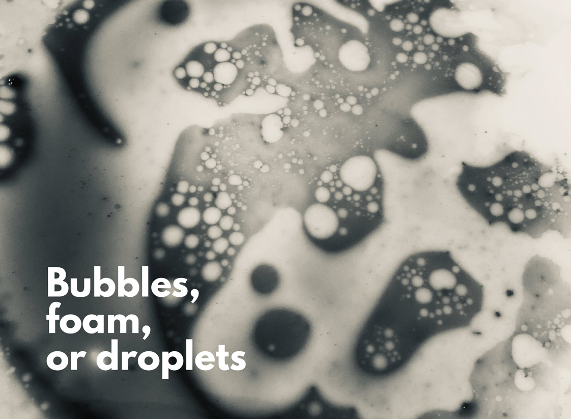 bubbles, foam, or droplets as a way of thinking about individual and collective maintenance activities—perhaps a campaign that emphasises the “doability” of maintenance when done habitually
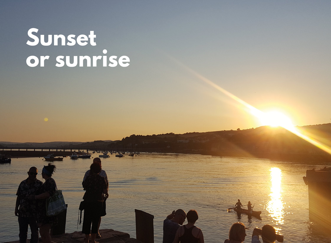 sunset or sunrise as a way of thinking about collective “spectating” of cycles—people enjoying watching the ongoing, endless rhythms of maintenance, knowing that others are part of the experience too
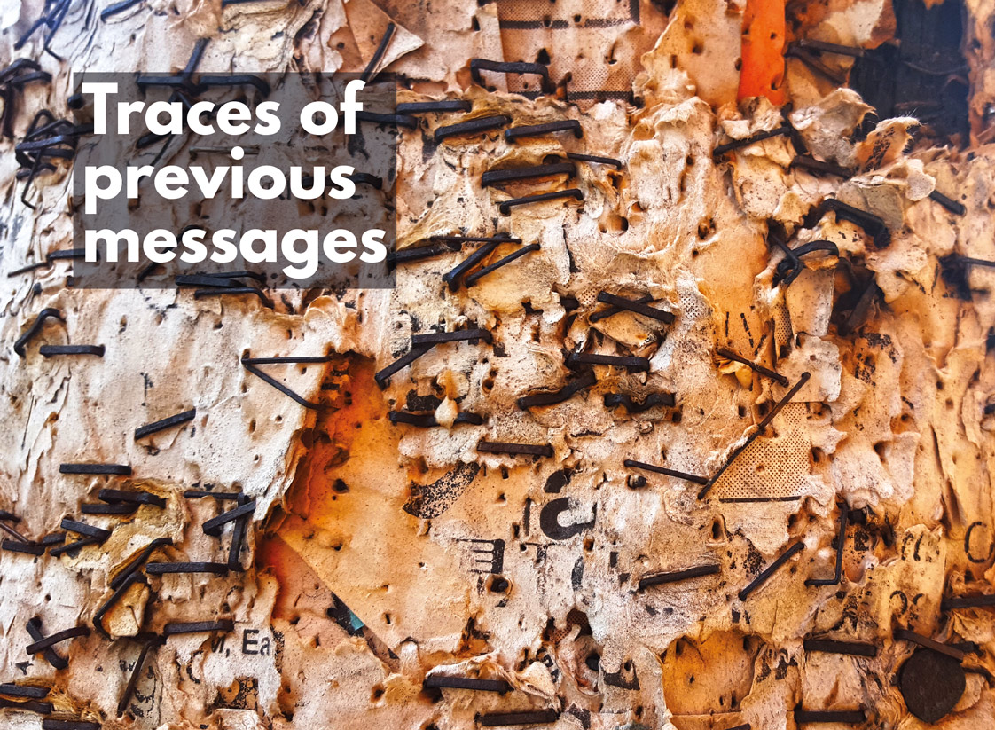
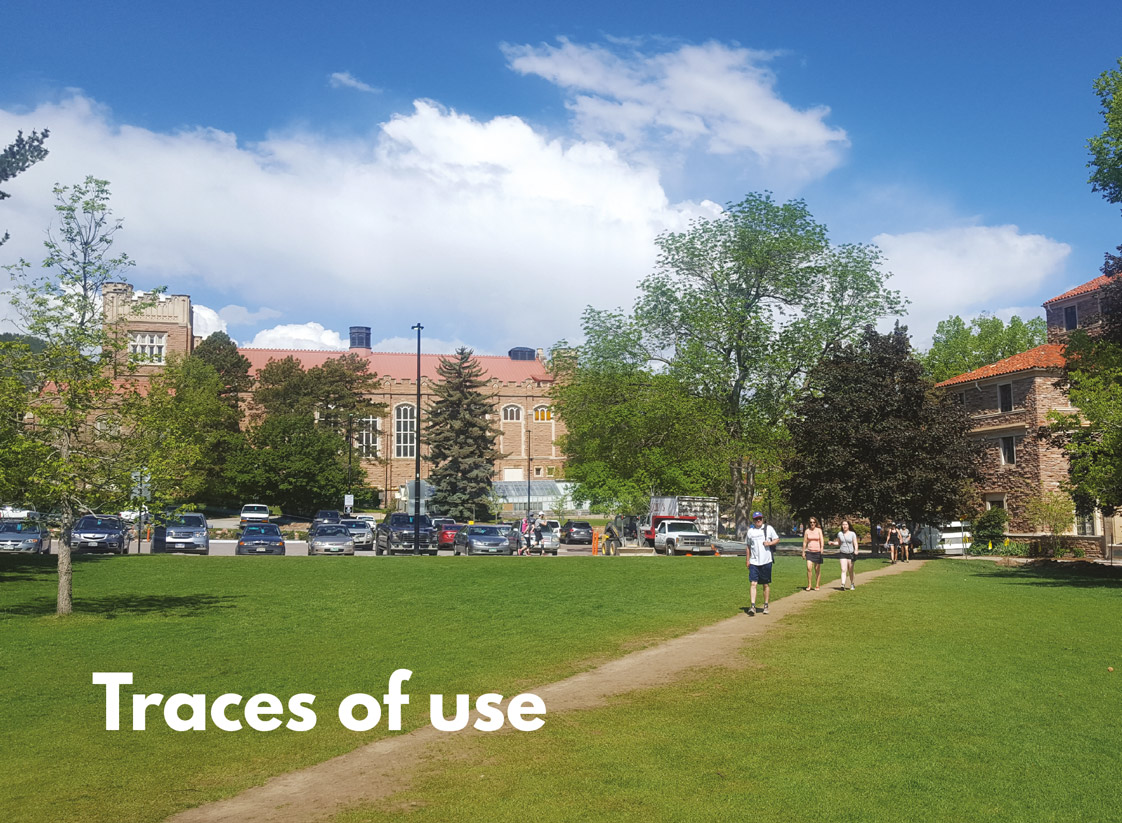 traces of use or previous messages as a way of seeing maintenance as part of the stories of objects or systems—other people’s roles, and adding our own parts of the story
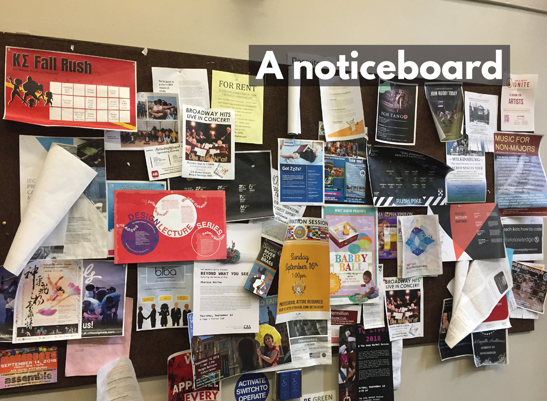
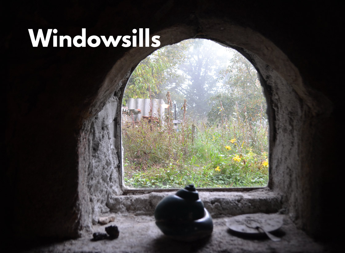 windowsills and a noticeboard as metaphors for places for showing off what’s happening, even things we’re proud of, very publicly—but which can become messy over time, perhaps need tidying

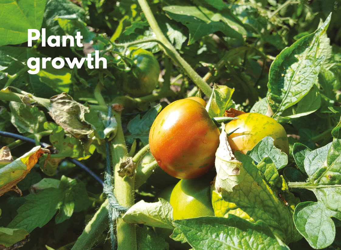
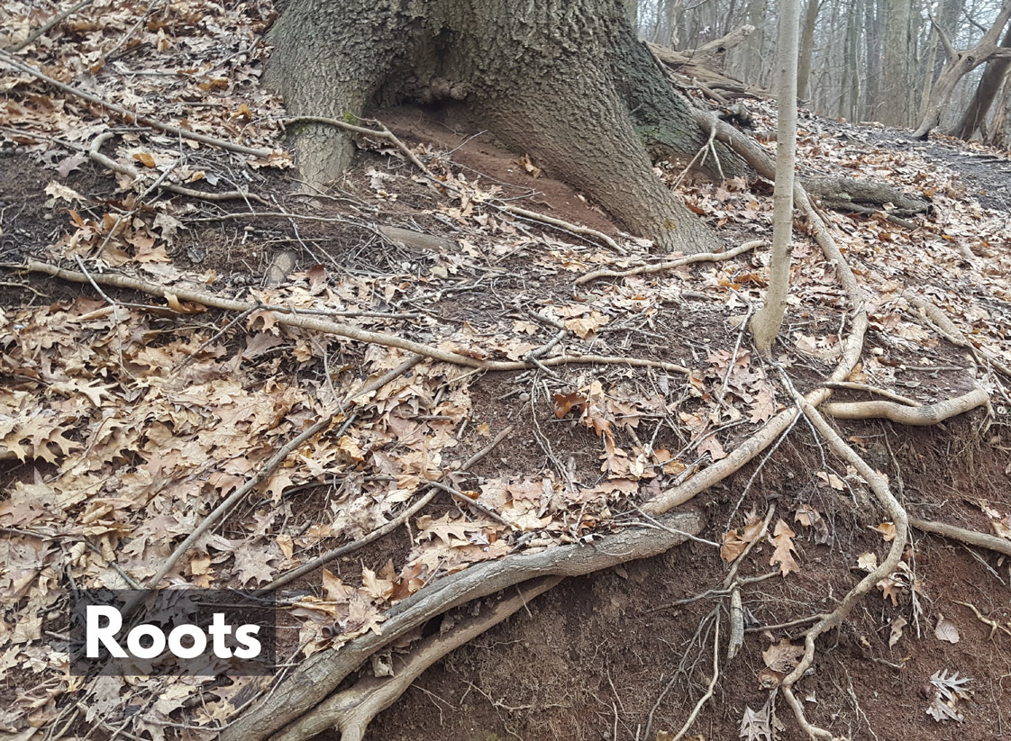 grazing is a form of maintenance itself, but it was noted how the act provides the grazer with something it needs—are there ways we could think about other forms of maintenance like this? plant growth and roots were thought of in terms of their progression over time—something ongoing, constant, part of plants’ cycles of existence and not solely one-off ‘events’
Many thanks to everyone who joined us for the event for your enthusiastic participation and ideas!
Going further
The Festival of Maintenance, now Maintain, and The Maintainers are the go-to communities for explorations of what maintenance means in its many forms, from maker spaces, to infrastructure, to care, to craft, to open source software, in both practical and academic senses.
Reading list
Here’s a short list of some of the things we read, looked at, and were pointed towards. I’m grateful to Naomi Turner and Cayla Key for introducing us to many of these.
Maintenance and tech cultures of innovation
Deb Chachra (2015), Why I Am Not a Maker
Shannon Mattern (2018), Maintenance and Care and (2019), Minimal Maintenance
Ella Fitzsimmons (2018), talk ‘Tech, Polyphony & Power‘
Ursula K LeGuin (1986), The Carrier Bag Theory of Fiction
Lee Vinsel and Andrew J Russell (2020), The Innovation Delusion
Stephen Graham and Nigel Thrift (2007), Out of Order: Understanding Repair and Maintenance
Care and repair
Maria Puig de la Bellacasa (2017), Matters of Care. Speculative Ethics in More than Human Worlds
Berenice Fisher and Joan Tronto (1990), Toward a feminist theory of caring
Hi‘ilei Julia Kawehipuaakahaopulani Hobart and Tamara Kneese (2020), Radical Care: Survival Strategies for Uncertain Times
Nazli Terzioglu-Ozkan and Renee Wever (2019), Integrating repair into product design education: Insights on repair, design and sustainability
Nazli Terzioglu-Ozkan, Dan Lockton, and Clare Brass (2015), Understanding User Motivations and Drawbacks Related to Product Repair
Cayla Key and Audrey Desjardins (2019). REP(AIR): An Olfactory Interface For Bike Maintenance