Sleep Ecologies: Tools for Snoozy Autoethnography (DIS 2020) from imaginaries on Vimeo.
Sleep Ecologies, supported by Philips, explored how designed tools for autoethnographic inquiry could help people understand their own sleep health, and the wider wellbeing and lifestyle ‘ecologies’ around it. Taking student sleep as a context, five undergraduates in the Design for Environments studio (Tammar Zea-Wolfson, Jackie Chou, Yuhan (Antonio) Song, Erin Ryan, and CJ Walsh) investigated bedtime routines, personal scheduling of time, focus, sleep data, and sleeping in non-traditional places.
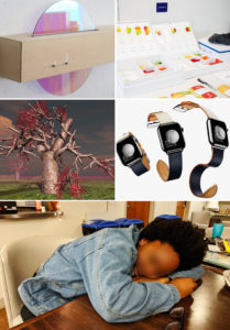
Brief details of each project are given in the exhibition catalogue (2019) designed by Jackie Chou, while the five projects are explained in detail in this article for the ACM Designing Interactive Systems conference:
Dan Lockton, Tammar Zea-Wolfson, Jackie Chou, Yuhan (Antonio) Song, Erin Ryan, and CJ Walsh. 2020. Sleep Ecologies: Tools for Snoozy Autoethnography. In Proceedings of the 2020 ACM Designing Interactive Systems Conference (DIS ’20). Association for Computing Machinery, New York, NY, USA, 1579–1591. DOI:https://doi.org/10.1145/3357236.3395482. Free PDF download
We also have a short pictorial paper for the DIS 2020 Research through Design in Situ workshop, which Tammar Zea-Wolfson and Dan Lockton presented.
Tammar Zea-Wolfson, Dan Lockton, Jackie Chou, Yuhan (Antonio) Song, Erin Ryan, and CJ Walsh. 2020. RtD for Self-Inquiry: Sleep Ecologies. Position paper for DIS 2020 workshop: Tom Jenkins, Will Odom, Kristina Andersen, Andy Boucher, David Chatting, Bill Gaver (2020). RtD in Situ: Discussing the Domains and Impact of Design Research. DIS 2020, online. Free PDF download.
A team of Master’s students, Stefania La Vattiata, Aadya Krishnaprasad, Michelle Chou, Deepika Dixit, Jisoo Shon, and Matt Geiger, also explored some ways in which other elements of sleep ecologies, such as caffeine consumption, could be included as part of a suite or kit of autoethnographic probes.