The ‘Piano Staircase’ from Volkswagen’s thefuntheory.com
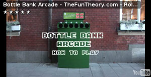
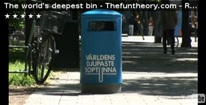
The Fun Theory (Rolighetsteorin), a competition / campaign / initiative from Volkswagen Sweden – created by DDB Stockholm – has been getting a lot of attention in the last couple of weeks from both design-related people and other commentators with an interest in influencing behaviour: it presents a series of clever ‘design interventions’ aimed at influencing behaviour through making things “fun to do” – taking the stairs instead of the escalator, recycling glass via a bottle bank and using a litter bin. The stairs are turned into a giant piano keyboard, with audio accompaniment; the bottle bank is turned into an arcade game, with sound effects and scores prominently displayed; and the litter bin has a “deep pit” effect created through sound effects played as items are dropped into it. It’s exciting to see that exploring design for behaviour change is being so enthusiastically pursued and explored, especially by ad agencies, since – if we’re honest – advertisers have long been the most successful at influencing human behaviour effectively (in the contexts intended). There’s an awful lot designers can learn from this, but I digress…
As a provocation and inspiration to enter the competition, these are great projects. The competition itself is interesting because it encourages entrants to “find [their] own evidence for the theory that fun is best way to change behaviour for the better”, suggesting that entries with some kind of demonstrated / tested element are preferred over purely conceptual submissions (however clever they might be) which have often been a hallmark of creative design competitions in the past. While the examples created and tested for the campaign are by no means “controlled experiments” (e.g. the stats in the videos about the extra amount of rubbish or glass deposited give little context about the background levels of waste deposition in that area, whether people have gone out of their way to use the ‘special’ bins, and so on), they do demonstrate very well the (perhaps obvious) effect that making something fun, or engaging, is a way to get people interested in using it.
Triggers
Going a bit deeper, though, into what “the theory of fun” might really mean, it’s clear there are a few different effects going on here. To use concepts from B J Fogg’s Behaviour Model, assuming the ability to use the stairs, bottle bank or bin is already there, the remaining factors are motivation and triggers. Motivation is, on some level, presumably also present in each case, in the sense that someone carrying bottles to be recycled already wants to get rid of them, someone standing at the bottom of the stairs or escalator wants to get to the top, and someone with a piece of litter in her hand wants to discard it somehow (even if that’s just on the ground).
(But note that if, for example, people start picking up litter from elsewhere in order to use the bin because they’re excited by it, or if – as in the video – kids run up and down the stairs to enjoy the effect, this is something slightly different: the motivation has changed from “I’m motivated to get rid of the litter in my hand” to “I’m motivated to keep playing with this thing.” While no doubt useful results, these are slightly different target behaviours to the ones expressed at the start of the videos. “Can we get more people to take the stairs over the escalator by making it fun to do?” is not quite the same as “Can we get people so interested in running up and down the stairs that they want to do it repeatedly?”)
So the triggers are what the interventions are really about redesigning: adding some feature or cue which causes people who already have the ability and the motivation to choose this particular way of getting out of the railway station to the street above, or disposing of litter, or recycling glass. All three examples deliberately, prominently, attract the interest of passers-by (“World’s deepest bin” graphics, otherwise incongruous black steps, illuminated 7-segment displays above the bottle bank) quite apart from the effect of seeing lots of other people gathered around, or using something in an unusual way.
And once they’ve triggered someone to get involved, to use them, there are different elements that come into play in each example. For example, the bottle bank – by using a game metaphor – effectively challenges the user into continuing (perhaps even entering a flow state, though this is surely more likely with the stairs) and gives feedback on how well you’re doing as well as a kind of reward. The reward element is present in all three examples, in fact.
Perhaps the most relevant pattern in all these examples, and the “fun theory” concept itself, is that of emotional or affective engagement. The user experience of each is designed to evoke an emotional response, to motivate engagement through enjoyment or delight – and this is an area of design where a lot of great (and commercially applicable) research work has been done, by people such as Pieter Desmet (whose doctoral dissertation is a model for this kind of design research), Pat Jordan, Marco van Hout, Trevor van Gorp, Don Norman and MIT’s Affective Computing group. Taking a slightly different slant, David Gargiulo’s work on creating drama through interaction design (found via Harry Brignull‘s Twitter) is also pertinent here, as is Daniel Pink’s collection of ’emotionally intelligent signage’ (thanks to Larry Cheng for bringing this to my attention).
What sort of behaviour change, though?
I suppose the biggest and most obvious criticism of projects such as the Rolighetsteorin examples is that they are merely one-time gimmicks, that a novelty effect is the most (maybe only) significant thing at work here. It’s not possible to say whether this is true or not without carrying out a longitudinal study of the members of the public involved over a period of time, or of the actual installations themselves. Does having fun using the stairs once (when they’re a giant piano) translate into taking the (boring) normal stairs in preference to an escalator on other occasions? (i.e. does it lead to attitude or preference change?) Or does the effect go away when the fun stairs do?
It may be, of course, that interventions with explicitly pro-social rhetoric embedded in them (such as the bottle bank) have an effect which bleeds over into other areas of people’s lives: do they think more about the environment, or being less wasteful, in other contexts? Have attitudes been changed beyond simply the specific context of recycling glass bottles using this particular bottle bank?
How others have done it
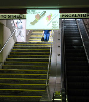
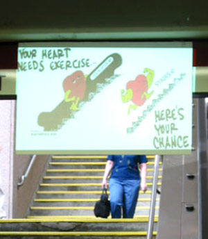
This campaign isn’t the first to have tried to address these problems through design, of course. Without researching too thoroughly, a few pieces of work spring to mind, and I’m sure there are many more. Stephen Intille, Ron MacNeil, Jason Nawyn and Jacob Hyman in MIT’s House_n group have done work using a sign with the ‘just-in-time‘ message “Your heart needs exercise – here’s your chance” (shown above) positioned over the stairs in a subway, flashing in people’s line-of-sight as they approach the decision point (between taking stairs or escalator) linked to a system which can record the effects in terms of people actually making one choice or the other, and hence compare the effect the intervention actually has. As cited in this paper [PDF], previous research by K D Brownell, A J Stunkard, and J M Albaum, using the same message, in a similar situation, but statically displayed for three weeks before being removed, demonstrated that some effect remains on people’s choice of the stairs for the next couple of months. (That is, the effect didn’t go away immediately when the sign did – though we can’t say whether that’s necessarily applicable to the piano stairs too.)
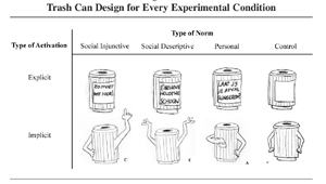 Last year I mentioned Finland’s “Kiitos, Tack, Thank you” bins, and in the comments (which are well worth reading), Kaleberg mentioned Parisian litter bins with SVP (s’il vous plaît) on them; most notable here is the work of Yvonne de Kort, Teddy McCalley and Cees Midden at Eindhoven on ‘persuasive trash cans‘ [PDF], looking at the effects of different kinds of norms on littering behaviour, expressed through the design or messages used on litter bins (shown to the left here).
Work on the design of recycling bins is, I think, worthy of a post of its own, since it starts to touch more on perceived affordances (the shape of different kinds of slots, and so on) so I’ll get round to that at some point.
Many thanks to everyone who sent me the Fun Theory links, including Kimberley Crofts, Brian Cugelman and Dan Jenkins (apologies if I’ve missed anyone out).