Whilst architectures of control in digital systems can be complex, there are many very simple control architectures in products which are either self-evident, or become so once the design intention is explained.
Restriction of access
Some of the most obvious involve attempts to restrict access of certain users. At a very basic level, locks and the keys that go with them (whether physical keys, or passwords, or PINs, or biometric identification systems) are architectures of control. But it is childproof lids on medicine bottles, placing things ‘out of reach of little hands’ and child locks on car doors with which we are most familiar.
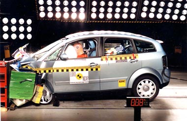
Equally, adult users may have their access restricted to particular components for safety reasons, although denying access in this way is often done for economic reasons–a recent example being the bonnet of the Audi A2, which is not intended to be opened by the car’s owner, but only by an authorised Audi dealer. It is presented as a ‘convenience’ feature–and some owners undoubtedly see it this way, for example this quote from an online review:
“You cannot open the bonnet–correct–a specialist has to open it for you–now I don’t know if some of you will think this a disadvantage, but I certainly didn’t! To access the water and oil supply, just flick a switch inside the car, and the Audi logo at the front of the vehicle flips open. There you will have access to fill up water and oil–clever stuff!” [31]

One way of opening the bonnet! Whilst it is in fact possible for the owner to release (detach) the bonnet/engine cover by turning two knobs in the ‘service flap’ at the front of the car (e.g. see the International Audi A2 Owners’ Club forums), it’s still an extra stage, removing control from the user and putting it into the hands of ‘experts’. Image from Euro NCAP.
The implications of restricting the ‘freedom to tinker’ (and even the ‘freedom to understand’) in this way will be examined in the sections on reactions later, but where the economic motive behind an architecture of control is more baldly obvious, such as Hewlett-Packard’s printer cartridge expiry (see Case Study: Printer cartridges), some consumer backlash has already started. Nevertheless, there is nothing unusual about economic lock-in; even when purchasing replacement parts for products where only the ‘genuine’ parts will fit (or where non-genuine parts will invalidate a warranty), from razor blades to batteries, we are consistently subject to it, reinforced by branding.
On a different note, many architectures of control in products are what Donald Norman calls ‘forcing functions’ (see Everyday things & persuasive technology)–“actions are constrained so that failure at one stage prevents the next step from happening” [32]. A common way of achieving this is an ‘interlock,’ which could be an aid to usability–to increase the likelihood that the product is operated in the correct order (for example, Steve Portigal suggests a card payphone where the card slot is underneath the handset, thus ensuring the handset is lifted before the card is swiped [33]).
Equally, interlocks can be used for more strategic disciplinary functions–preventing illegal acts by the user, such as a breathalyser fitted to a car’s ignition system such that only when the test is ‘passed’ can the car be started. There are variants of this, e.g. the ‘Simple Simon’ memory game using coloured lights, used on the MG/British Leyland SSV1 ‘safety car’ prototype in the 1970s, which would also deal with overly tired or drugged drivers:
“Get the (randomly generated) sequence wrong three times in a row, and [the driver] would have to wait an hour before being allowed to try again. While designed primarily as a safety device, this feature also doubled as pretty effective immobiliser.” [34]
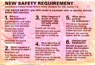
Another commonly cited forcing function for a car ignition is a seat-belt interlock–championed by Lee Iacocca in the 1970’s, and briefly made mandatory on new cars in the United States, but deeply unpopular [32, 35]. “In response to public pressure, Congress took about twenty minutes to outlaw Interlock. They replaced it with an eight-second buzzer that would remind passengers to buckle up” [35].

The Interlock warning label from this 1974 VW Karmann Ghia (image from Type2.com)warns ‘NEVER attempt to defeat the Interlock!’; nevertheless, there was nothing to stop the driver buckling the belt and sitting on it if he or she wanted to. The label also admits that bags or luggage on the seat will also prevent the engine starting until the seat is cleared; one might expect that, given how many people carry things on the front passenger seat while driving alone, the repeated frustration of Interlock intervening would cause significant antipathy towards the system.
Whilst there are ways to defeat the interlock on these examples, e.g. “many people kept their seat-belts buckled–but without wearing them” [35], depending on how the architectures of control are designed into products, the amount of effort required to overcome them may be too great for most users, even if there are cost or convenience benefits. Apathy, and a fear of ‘meddling’ with devices which may have been an expensive outlay in the first place, may in themselves be significant architectures of control.
Related to interlocks are ‘lock-ins’ (in a different sense to the economic usage mentioned above) and lock-outs. In this sense a lock-in is a forcing function which prevents (or delays) a user from stopping an operation or action which is deemed important. In product terms, an example might involve certain buttons or keys being temporarily disabled, perhaps where accidentally pressing them would be detrimental.
Norman suggested, in 1988, the idea of ‘soft’ off switches for computers, which permit files and settings to be saved before allowing the power to be cut [32], and indeed such soft power switches are now the norm. In terms of control, this can be either useful to the consumer, or an irritation (in cases where a quick power-down is required), but it’s difficult to see it as a strategic architecture of control. Lock-ins with strategic intentions include ‘nag’ screens on software which require the user to wait a certain amount of time before clicking ‘OK’ (i.e. exiting the current ‘operation’) in the hope that a promotional message will be read (or that the irritation will become sufficient that the user registers, or pays for, the product [36]). In some cases, this type of lock-in is used to increase (marginally) the likelihood that an EULA will be read, by requiring that the user at least scroll to the bottom before proceeding.

This Microsoft EULA implementation ‘knows’ if the user ticks the box without actually having read the agreement, and won’t let the user proceed.
Lock-outs are perhaps more obviously ‘architectures of control’–the aim being to prevent undesirable behaviour or events from occurring. A good example given by Norman is a barrier on a staircase to prevent people, in a panic (e.g. in the event of a fire), accidentally running downstairs past the ground floor and into a basement [32].
To a large extent, forcing functions as architectures of control have been inherent in product design and engineering for many decades without necessarily being explicitly recognised as such.
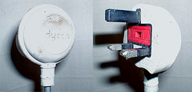
The idea of mistake-proofing, (poka-yoke in Shigeo Shingo’s system, as applied at Toyota and other Japanese firms [37]), whilst by no means identical with the idea of architectures of control, is a common theme in design [38], ranging from manufacturing engineering (much machinery cannot be switched on until safety guards are in place) to project management (critical path analysis or Gantt charts to ensure that operations are performed in the correct order) to safety in consumer products (the long earth pin on UK electric plugs enters the socket first and removes the guard which otherwise prevents objects being inserted).

The long earth pin on UK electric plugs enters the socket first to remove a spring-loaded guard which otherwise covers the neutral and live terminals to prevent objects being inserted.
Some would certainly fall into the ‘architectures of control’ category, whether physical (such as cattle-grids), or a combination of physical and psychological (cone-shaped disposable cups, discouraging users from leaving them on tables); particularly in quality management within manufacturing industry, the architectures of control in mistake-proofing (such as designing parts which can deliberately only be assembled one way) are in fact, commercially strategic, since the business’s reputation can depend significantly on maintaining a low error rate in its product assembly. The thinking of ‘design for manufacture and assembly’ promulgators such as Boothroyd and Dewhurst [e.g. 39] is evident in many of these often very simple mistake-proofing architectures.
Mistake-proofing and forcing functions in medical environments are also common, both in terms of isolating safety hazards and ensuring procedures are followed. The challenge of retaining these architectures of control once a patient is in charge of his or her own treatment (such as taking the correct dose and combination of pills [e.g. 40], or performing particular exercises) should not be underestimated, and is indeed an area of very worthwhile current research [41].
New opportunities for architectures of control in products
The idea of encouraging/incentivising people to exercise (whether for specific medical reasons or on more general health grounds) is a recurring theme, both in gentler ‘persuasive technologies’–see ‘Academic precedents: everyday things and persuasive technology’–and as architectures of control.
Square-Eyes, an electronic children’s shoe insole developed by Gillian Swan at Brunel University, records how many steps the child takes during a day, and ‘translates’ that into a certain number of minutes of ‘TV time,’ with the information transmitted to a base station connected to, and controlling, the television [42]. There is no easy way around it for the child: he or she must exercise in order to obtain the ‘reward,’ and as Tim Ambler points out [43], even ‘cheating’ by, say, jumping up and down on the spot rather than walking or running will still be exercise. All in all, an interesting architecture of control, with possible consequences beyond the child–Brunel Design’s Paul Turnock suggests that “it will raise awareness among the family of their sedentary lifestyle and bring about a change in behaviour for the whole family” [44].


100 steps recorded by the Square Eyes insoles (styling model in left-hand image; functional prototype in right-hand image) equates to precisely one minute of TV time, as controlled by the base station (blue box in left-hand image). From *sharper.
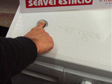
On a more whimsical premise, but retaining the theme of showing how technology is allowing architectures of control to become embedded in design thinking, is Your Turn, a washing machine from Pep Torres of Spanish creative agency DeBuenaTinta, which cannot be operated by the same person twice in a row, by using biometric identification. “It’s an invention that has a philosophy behind it and I hope both women and men will think it’s time for the men to do more around the house” [45].

Your Turn may be ‘a tongue-in-cheek idea which seemed to catch the imagination,’ but one can easily think of possible ways of applying a similar biometric architecture of control to regulate access in other situations–even, say, as simple as ensuring that a child can only buy one sugary snack per day from a vending machine. Image from BBC News.
Would this kind of system have been conceivable on a consumer product twenty years ago? Possibly, but perhaps the widespread use of passwords and identification systems, and the apparent ease with which they now pervade new technology, has made it much more realistic to consider incorporating architectures of control into new products–right from the concept stage.
Previous: Architectures of control in the digital environment | Next: Strategic intentions
Pingback: Architectures of Control in Design » Architectures of control that actually endanger life
Pingback: Architectures of Control in Design » An interlock example
Pingback: Architectures of Control in Design » Forcing functions designed to increase product consumption
Pingback: Architectures of Control in Design » Freedom to Tinker - The Freedom to Tinker with Freedom?
Pingback: Architectures of Control in Design » ‘Breathalyser phone stops drinkers making embarrassing calls’ - LG LP4100
Pingback: Architectures of Control in Design » The illusion of control
Pingback: Architectures of Control in Design » Round-up of some control examples
Pingback: Education, forcing functions and understanding at fulminate // Architectures of Control
Pingback: Making exercise cooler at fulminate // Architectures of Control