I’ve come across some interesting student projects at various shows and exhibitions this summer, some of which address the relationship between design and people’s behaviour in different situations, and some of which explicitly aim to influence what people do and think. Here’s a selection (Part 2 and Part 3 will follow).
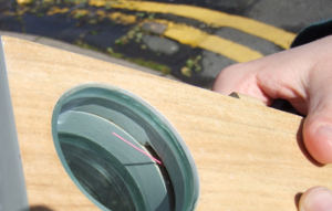

Jasmine Cox‘s Displacement Engine (Dundee) is “a navigational compass which gives you a little extra push to break away from routine, to wander the unexplored route… By pulling the slider closer and pushing it further away, the user learns to relax the need to be heading in an absolute direction. It allows the experience of a place and an outdoor space to absorb and distract them.” The variability of the GPS signal means that the device perhaps won’t always be ‘reliable’ – again, leading the user to explore and think for him or herself rather than being able to trust the device entirely. As Jasmine says here, it’s somewhere between a sat-nav and dérive.
The question of how much the paths and routes we take (physically and in whatever metaphorical way you can think of) are controlled, or at least influenced, by what maps, devices, signs, etc are telling us is something that I’ve touched a few times with this blog over the years (e.g. here). Practical semiotics as wayfinding decision-making heuristics, maybe. As someone who grew up obsessively poring over maps and atlases, memorising road networks and coastlines, trying to visualise these unknown places (and drawing plenty of my own), I’m fascinated by the possibilities of sat-navs and navigational devices which structure our choices for us (as Adam Greenfield notes, perhaps even removing routes we ‘don’t want to be walking down’), even though (in practice) I very much dislike using them, and it horrifies me to become reliant on them. I’ve had the “ROAD ENDS 800 FEET” sign looming at me out of the night after following a calm voice’s directions down a canyon track somewhere off Mulholland Drive. I’ve also spent happy afternoons driving across the Fens with a scruffy, annotated Philip’s Navigator on my lap and no purpose in mind other than seeing interesting places, and I know which I prefer. Jasmine’s project helps bridge that divide a bit, or at least twist it in a new and intriguing direction.
Jasmine’s blog chronicling the development process is interesting, too: it’s a great insight into the thought processes of how a project like this actually gets done, the decisions made at different stages, and how contingent the result is on conditions, insights and ideas earlier on. I expect something like this helps quite a lot with writing up a major project, though I know I always wrote the development story for my projects right at the end, when the various dead-ends and mistakes could be woven and re-ordered into something that sounded more professional, or so I hoped.

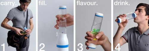
Intended to encourage people to drink more water while out shopping or walking, without buying bottled water (and throwing away the bottle each time) Source by Oliver Craig (Loughborough) is essentially a modern take on the public water fountain (which has disappeared in many areas of the UK – how many new shopping centres include them?), combining it with the convenience of bottled water: using special bottles filled via a valve in the base, pedestrians could get free filtered tap water from a network of fountains, positioned at the entrances to participating stores who would also sell the bottles. Re-using the bottles earns the user points which can be spent in the participating stores.
From one point of view, free fountains which don’t require a special bottle (i.e. no format lock-in) would be preferable (as so often in the UK, the concern is about “value for money” and vandalism rather than public need), but something like Source, with special bottles, the sale of which funds the scheme, could be a step in the right direction.
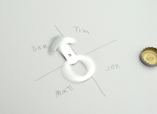
Ravensbourne’s Kei Wada‘s How Long? Door Knob and Tag, along with his Whose Turn? Bottle Opener address behaviours in a shared environment such as a student house, applying design to ‘bad habits’. The Bottle Opener (right, below) “is a playful bottle opener that can be spun to help make decisions” such as who has to take the rubbish out, or buy milk, in the format of an object associated with parties and fun (whether this would increase or decrease the likelihood that housemates adhere to the ‘decision’, I don’t know!).
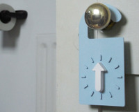
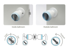
The Door Knob and Tag (left and middle, below) are timers for bathroom or shower doors – the knob is a replacement knob / lock for the door itself, while the tag can be hooked over the handle without actually enforcing a ‘lock’. But the principle is the same: “inspired by the annoying occurrence of never knowing how long flatmate will take in the shower. The person who takes the shower sets the timer when he/she locks the door, so the other housemates do not have to knock on the door and disturb their ablutions. When time is up, it rings to let the housemates know the room is vacant.” I particularly like Kei’s statement that “the act of setting the timer now becomes an extension of the motions involved in locking the door” – whether or not this kind of action (which requires prior thought in terms of deciding how long to set it for) could become an unconscious habit or not would be interesting to study.
Aside from annoying your housemates less, the timers could also work to reduce water and energy usage, in terms of time spent in the shower: if the alarm ringing sound were annoying or loud enough to make it socially unacceptable to spend too long in there, then this is a kind of socially enforced shower timer.
More projects coming up in Parts 2 and 3…
Images from the graduates’ websites linked.