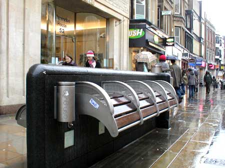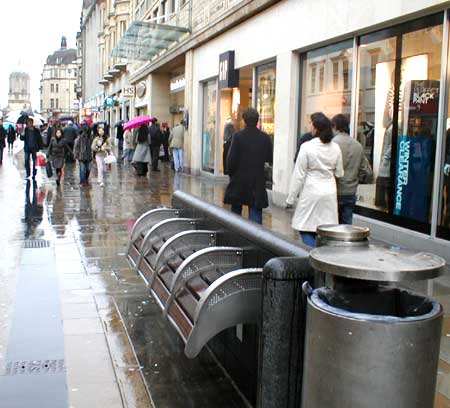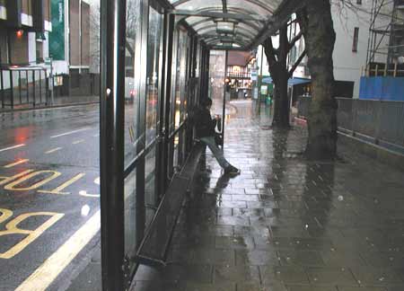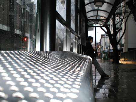


Top two photos: A bench on Cornmarket Street, Oxford; Lower two photos: A bus stop seat perch on Castle Street.
While from a very narrow specification point-of-view ‘they do their job’, what utter contempt for users these two seating examples demonstrate! The benches on Cornmarket Street are clearly intended to prevent anyone lying down on them (armrests, small radius of curvature) or indeed sitting for very long at all in comfort (height off the ground, vertical backrest, small radius of curvature). Why? Why despise the public so much?
The designer must have been given a specification requiring all the above features: I can’t believe they just arose out of aesthetic or manufacturing considerations. That bench has been engineered to restrict, control and discipline users. Was it really necessary? Does forcing the homeless to lie on the ground instead, or preventing people sitting comfortably and watching the world go by really ‘solve’ any problems?
The bus stop perch – in this particular location intended at least partially for Park & Ride users – is perhaps even worse. It’s angled such that a young child couldn’t easily sit on it without sliding off. An adult has to stretch out his or her legs just to perch. A parent couldn’t sit next to a young child. A shopper would have to put down his or her bags on the ground, since they’d slide off the perch. My girlfriend and I couldn’t rest our drinks on the bench next to us; we had to put them on the ground. OK, that’s not much of a hardship, but it’s just frustrating design, intended to serve objectives other than the users’ benefit or convenience.
You wouldn’t want to wait any longer than necessary at that bus stop. If you were making the decision about whether to drive into Oxford or take the bus to go shopping (assuming cycling not to be an option for this) the unattractiveness of perching at an angle for 15 minutes on that mean strip of perforated sheet would begin to weigh heavily against the public transport option. Sure, you might end up sitting in your car in heavy traffic for 15 minutes, but it’s your car. The seats are comfortable, it’s warm, and you can shape and adjust the environment to suit you.
I don’t want to go off on one here about solving (or easing) Britain’s transport problems, but I do feel that this kind of situation embodies some of the very important issues. By making bus users feel unwanted – despised even – you don’t enhance the image or desirability of the mode of travel. Little details such as this can make a huge difference to perceptions. The buses themselves are great, but if the experience of using the service seems to demonstrate contempt for the user, the user may develop contempt for the service.
Japan may have some of the most explicitly user-unfriendly public benches we’ve come across so far, but there’s also something rather disturbing about the sheer blandness of the bench implementations shown above. Their starkness embodies the thinking behind the design: all possible interaction methods to be reduced down to one sole, pre-defined utility function, with the user not permitted to do anything outside that intentionally myopic definition.
(Incidentally, to be fair, there were some lower seats with horizontal platforms on the other side of the bench in Cornmarket Street. They still had armrests to prevent lying down (or even sitting close to someone), but were not as awful as the curved ones.)