Continued from part 1

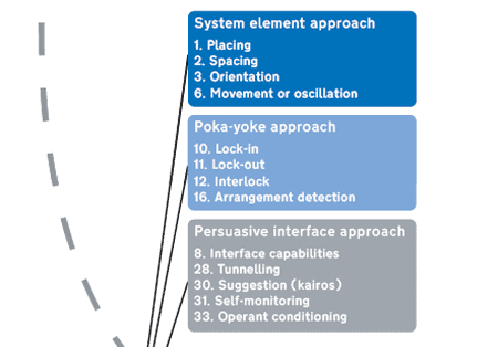
These are the suggested mechanisms applicable to User follows process or path, performing actions in a specified sequence – they fall roughly into three ‘approaches’. In this post, I’m going to examine the System element approach.
System element approach
This approach includes mechanisms relating to the layout and properties of system elements, hence all technical rather than human factors.
Placing, Spacing and Orientation – how system elements are laid out – are some of the most fundamental mechanisms a designer can employ to help a user to follow a process or path in the intended sequence, and can be used both in the ‘real’ world and, as metaphors, in software. Movement or oscillation, as an ‘action’ property of system elements, which may involve changing their placing/spacing/orientation, can also be used to help achieve similar aims.
Placing
Placing may be implemented as simply as arranging interactive elements (functions, buttons, shops, products on shelves – effectively, anything) in sequence so that a user interacts (sees / notices / experiences / uses) them in the ‘right’ order. This might involve actually hiding one element behind another so that the first ‘must’ be dealt with before progressing to the next (or only displaying the second element once the first has been dealt with), but often this is not necessary: users will tend to interact with elements in a predictable sequence, at least where it is clear which direction the sequence is meant to progress (compare reading directions in different alphabets, for example, and the effect this has on the layout of interfaces).

Example: The elements of Amazon’s order process, revealed to the user in sequence
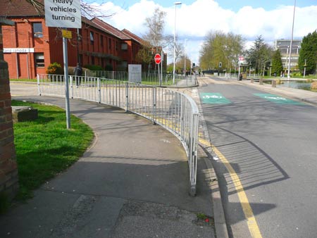
Placing can also involve arranging (non-interactive) elements to ‘channel’ users along a path in an intended sequence – walls, fences and guard rails are obvious architectural examples, but there are more subtle ones too, such as the layout of some casinos in which winners are ‘funnelled’ past many lures on their way to a single cashier.

Example: Guard rails are placed to channel pedestrians away from crossing at the mouth of a road junction
Spacing
Spacing – deliberate separation of system elements in space – can also be used strategically to cause users to follow a path or sequence of operations or interactions. For example many supermarkets are laid out with common items such as milk and bread at the back of the store, meaning that shoppers pass many other shelves of items (with potential for impulse purchase) on the way to their ‘target’, and on the way back to the checkouts at the front of the store.
Spacing can also be used to cause users to follow procedures requiring a delay between performing operations – the ‘on’ switch for a lathe may be spaced far enough away from the chuck that it is impossible for the operator’s fingers to be in a dangerous position as the device is switched on. Along similar lines, spacing light switches for different parts of a corridor or stairway apart so that they must each be switched on in sequence individually when needed (rather than allowing users to switch them all on at once) may reduce unnecessary electricity use.

Example: Dairy items are often positioned to drive traffic to the rear of a supermarket. Image from wander.lust
Orientation
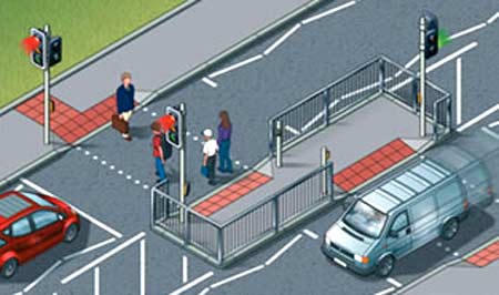
Orientation is necessarily related to placing and spacing – the relative angle or attitude of system elements can be used as a mechanism for encouraging or channelling users to follow a path or perform actions in sequence. A trivial example is the use of angled walls to ‘funnel’ pedestrians along a particular path. It can also be used to cause users themselves to change their orientation in response, where this is part of an intended sequence of user behaviour – the staggered pedestrian crossings which make sure users turn to face the direction of oncoming traffic, as mentioned in Part 1, use the changing orientation of the walkway to change users’ orientation.

Example: A staggered pedestrian crossing designed so that users face oncoming traffic. Image from the UK Highway Code.
Movement or oscillation
Movement or oscillation may involve changing the placing/spacing/orientation of system elements, and can be applied in a physical or metaphorical sense. A moving indicator which guides the user through a process or sequence, or indeed, brings system elements which require interaction to the user (or routes them past), encourages (or forces) following procedures in the ‘right’ order.
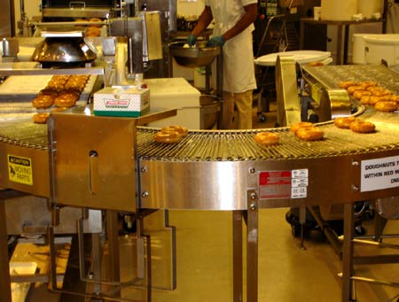
Consider this mechanism as a dynamic implementation of placing/spacing/orientation: it has the potential to control much more fully the order in which users are exposed to objects or functions. The most obvious examples are conveyors on production lines, bringing components or products to stationary workers in the right sequence, but even museum exhibits such as the Crown Jewels may be displayed in a rotating or constantly moving case, which displays them to visitors in a certain order and reduces the possibility of undesired interactions.

Example: A conveyor (such as this on a Krispy Kreme doughnut preparation line) brings products or components to workers in the right sequence. Image from Silversprite
In part 3, we’ll look at the Poka-yoke approach to getting someone to do things in a particular order.