Bonjour / Goeiendag to visitors from Design for Persuasion: while you’re here, you might also like to download a free poster [PDF] which has 12 of the Design with Intent patterns on it in a handy reference form. Thanks for stopping by!
The Visual Lens combines ideas from product semantics, semiotics, ecological psychology and Gestalt psychology about how users perceive patterns and meanings as they interact with the systems around them.
These techniques are often applied by interaction designers without necessarily considering how they can influence user behaviour.
Prominence & visibility
“You can’t miss it”
â– Design certain elements so they’re more prominent, obvious, memorable or visible than others, to direct users’ attention towards them, making it easier for users to pick up the message intended, or pick the ‘best’ options from a set of choices
â– Simple prominence is one of the most basic design principles for influencing user behaviour, but visibility can also include using transparency strategically as part of a system–drawing users’ attention to elements which would otherwise be hidden
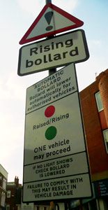
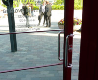
Examples: The most important warning signs should be the most prominent–if a user only has time to take in one message, it should be the one that matters the most (above)
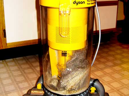
A Dyson vacuum’s transparent chamber makes forgetting to empty it unlikely, thus keeping the effectiveness of the cleaner high and improving user satisfaction (below)
 This pattern is about enabling user behaviour: making it easier to make certain choices
Metaphors
“This reminds me of one of those, so I expect
it works that way too”
â– Use design elements from a context the user understands in a new system, to imply how it should be used; make it easy for users to understand a new system in terms they already understand
â– There’s a danger of oversimplification, or misleading users about the consequences of actions, if metaphor use is taken to extremes; it can also trap users in old behaviour patterns
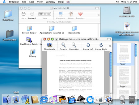
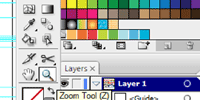
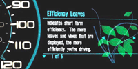
Examples: Everyday software interfaces (above and below left) combine hundreds of metaphors, from the ‘desktop’, ‘folders’ and ‘trash/recycle bin’ themselves to the icons used for graphics functions such as zoom (magnifying glass), eyedropper and so on. Ford’s SmartGauge (below right) uses ‘leaves’ to represent efficiency of a user’s driving style
Metaphors are mainly about enabling user behaviour…
 but can also motivate a user to ‘know’ by increasing mindful understanding of how best to use a system.
[column width=”47%” padding=”6%”]
Perceived affordances
“Looks like you use it this way…”
â– Perceived affordances are what it looks like we can do with something. A button looks like we should push it; a door with a handle looks like we should pull it, whereas a door with a plate looks like we should push it. This is fundamental to interaction design, and in influencing user behaviour, since the actions a design ‘suggests’ to a user will probably be carried out. (There may be hidden affordances too.)
â– Related ideas include mappings – laying out controls so they relate intuitively to the functions they control – and perceived constraints, what users perceive they can’t do with something.
Example: Where a door has a handle, we assume we should pull it. When this isn’t the case, usability suffers!
[/column][column width=”47%” padding=”0%”]
Implied sequences
“Easy as 1,2,3…”
â– Presenting items in an implied sequence suggests to users that they should be used / experienced in order. Remember that in while in western countries, our reading direction leads us to assume sequences go left-to-right, in other cultures right-to-left may be the norm, e.g. this Hebrew version of the Mozilla browser with right-facing “back” arrow and left-facing “forward” arrow.
â– The sequence of choices can also suggest levels of priority / hierarchy – there’s a small advantage for candidates who are listed first on a ballot paper [PDF]. The order in which options are revealed can also be important, both in terms of what people remember and how they make comparisons
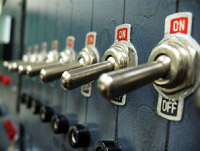
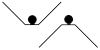
Example: Rows of switches such as these can suggest a sequential form of operation
[/column][column width=”47%” padding=”6%”]
Possibility trees
“What route should I take?”
â– Possibility trees show users what routes they can follow to achieve a goal, or what results different behaviours can lead to. The way these are presented, via instructions, an interface, or even signage or maps – wayfinding (e.g. these Transport for London studies) – can influence the choices users make. .
â– They can be used strategically: showing users the routes that planners would prefer them to take, or the actions that designers would like users to take.
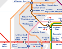
Example: Once people have become used to using a highly stylised map to plan journeys, such as the London Underground map here, it can affect perceptions of places’ location in real life. For example, Willesden Junction and North Acton stations are a 10-15 minute walk apart, but the distortion introduced by the map suggests that the distance is much further, which in turn can influence the transport choices people make.
[/column][column width=”47%” padding=”0%”]
Watermarking
“Taking (or showing) ownership”
â– In this context, watermarking means making the ownership (or background) of something evident to users. If people feel they own a device, through some kind of personalisation or acknowledgement that it’s theirs, they will often use it differently to when it seems like it belongs to someone else.
â– One application of this to influencing behaviour is to make it clear or obvious that some shared resources belong to everyone, or to the community, rather than no-one in particular.
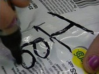
Example: A Gloucestershire shopkeeper has taken to writing customers’ names on the packaging of snacks they buy, to encourage them not to litter by ‘taking ownership’ – it has apparently been especially successful with children.
[/column][column width=”47%” padding=”6%”]
Proximity & similarity
“Those look like they go together”
â– Users will tend to perceive that design elements (buttons, controls etc) which look similar, or are arranged together, will have similar functions or work together as a group (Gestalt proximity and similarity).
â– This can be used strategically to influence user behaviour as a kind of framing technique: group functions that you want users to perceive as going together, or give the controls similar shapes or colours. Likewise, introducing deliberate discontinuity or separation between elements can lead users to treat them very differently.
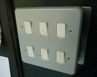
Example: Bringing light switches together like this allows them all to be switched off at once more easily when leaving a room, but can work against the intuitive mapping linking each switch to the lights it controls.
[/column][column width=”47%” padding=”0%”]
Colour & contrast
“I simply chose the one that stood out the most”
â– Use colour and visual contrast to influence users’ perceptions and moods, suggest associations between particular behaviours and outcomes, and cause users to notice important elements or information (remembering that colour-blindness affects many millions of users, and so has implications for designers)
â– While some research shows that certain colours can have direct effects on behaviour in certain situations (e.g. the colour of pills), the evidence in general is weaker than is sometimes implied. Nevertheless, clever use of colour can help, support and guide user decision-making and so influence behaviour.

Example: Baker-Miller Pink or “drunk-tank pink” was developed through trials in prisons where painting a cell this colour was found, in certain circumstances, to reduce inmates’ aggression.
[/column][end_columns]
Photos/screenshots by Dan Lockton except Dyson by Skylarprimm, toggle switches by trancedmoogle, Ford Smartgauge from Ford promotional material on Jalopnik, shopkeeper writing on packet from BBC News story; London Underground map screenshot from Transport for London website.
____________________
The Design with Intent Toolkit v0.9 by Dan Lockton, David Harrison and Neville A. Stanton
Introduction | Behaviour | Architectural lens | Errorproofing lens | Persuasive lens | Visual lens | Cognitive lens | Security lens
Pingback: Design with Intent | The Design with Intent Toolkit v.0.9
Pingback: Design with Intent | Some interesting projects (Part 1)
Pingback: Design with Intent | Errorproofing Lens: The Patterns
Pingback: Design with Intent | Security Lens: The Patterns
Pingback: Design with Intent | Thoughts on the ‘fun theory’
Pingback: Design with Intent | Through London with the DwI goggles on
Pingback: Anonymous