One view of influencing user behaviour – what I’ve called the ‘errorproofing lens’ – treats a user’s interaction with a system as a set of defined target behaviour routes which the designer wants the user to follow, with deviations from those routes being treated as ‘errors’. Design can help avoid the errors, either by making it easier for users to work without making errors, or by making the errors impossible in the first place (a defensive design approach).
That’s fairly obvious, and it’s a key part of interaction design, usability and human factors practice, much of its influence in the design profession coming from Don Norman’s seminal Design of Everyday Things. It’s often the view on influencing user behaviour found in health & safety-related design, medical device design and manufacturing engineering (as poka-yoke): where, as far as possible, one really doesn’t want errors to occur at all (Shingo’s zero defects). Learning through trial-and-error exploration of the interface might be great for, say, Kai’s Power Tools, but a bad idea for a dialysis machine or the control room of a nuclear power station.
It’s worth noting a (the?) key difference between an errorproofing approach and some other views of influencing user behaviour, such as Persuasive Technology: persuasion implies attitude change leading to the target behaviour, while errorproofing doesn’t care whether or not the user’s attitude changes, as long as the target behaviour is met. Attitude change might be an effect of the errorproofing, but it doesn’t have to be. If I find I can’t start a milling machine until the guard is in place, the target behaviour (I put the guard in place before pressing the switch) is achieved regardless of whether my attitude to safety changes. It might do, though: the act of realising that the guard needs to be in place, and why, may well cause safety to be on my mind consciously. Then again, it might do the opposite: e.g. the steering wheel spike argument. The distinction between whether the behaviour change is mindful or not is something I tried to capture with the behaviour change barometer.
Making it easier for users to avoid errors – whether through warnings, choice of defaults, confirmation dialogues and so on – is slightly ‘softer’ than actual forcing the user to conform, and does perhaps offer the chance to relay some information about the reasoning behind the measure. But the philosophy behind all of these is, inevitably “we know what’s best”: a dose of paternalism, the degree of constraint determining the ‘libertarian’ prefix. The fact that all of us can probably think of everyday examples where we constantly have to change a setting from its default, or a confirmation dialogue slows us down (process friction), suggests that simple errorproofing cannot stand in for an intelligent process of understanding the user.
On with the patterns, then: there’s nothing new here, but hopefully seeing the patterns side by side allows an interesting and useful comparison. Defaults and Interlock are the two best ‘inspirations’ I think, in terms of using these errorproofing patterns to innovate concepts for influencing user behaviour in other fields. There will be a lot more to say about each pattern (further classification, and what kinds of behaviour change each is especially applicable to) in the near future as I gradually progress with this project.
Defaults
“What happens if I leave the settings how they are?”
â– Choose ‘good’ default settings and options, since many users will stick with them, and only change them if they feel they really need to (see Rajiv Shah’s work, and Thaler & Sunstein)
â– How easy or hard it is to change settings, find other options, and undo mistakes also contributes to user behaviour here
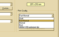

Examples: With most printer installations, the default print quality is usually not ‘Draft’, even though this would save users time, ink and money.
In the UK, organ donation is ‘opt-in’: the default is that your organs will not be donated. In some countries, an ‘opt-out’ system is used, which can lead to higher rates of donation
Interlock
“That doesn’t work unless you do this first”
â– Design the system so users have to perform actions in a certain order, by preventing the next operation until the first is complete: a forcing function
â– Can be irritating or helpful depending on how much it interferes with normal user activity–e.g. seatbelt-ignition interlocks have historically been very unpopular with drivers


Examples: Microwave ovens don’t work until the door is closed (for safety).
Most cash machines don’t dispense cash until you remove your card (so it’s less likely you forget it)
[column width=”47%” padding=”6%”]
Lock-in & Lock-out
â– Keep an operation going (lock-in) or prevent one being started (lock-out) – a forcing function
â– Can be helpful (e.g. for safety or improving productivity, such as preventing accidentally cancelling something) or irritating for users (e.g. diverting the user’s attention away from a task, such as unskippable DVD adverts before the movie)
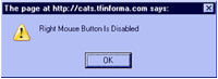
Example: Some websites ‘disable’ right-clicking to try (misguidedly) to prevent visitors saving images.
[/column][column width=”47%” padding=”0%”]
Extra step
â– Introduce an extra step, either as a confirmation (e.g. an “Are you sure?” dialogue) or a ‘speed-hump’ to slow a process down or prevent accidental errors – another forcing function. Most of the everyday poka-yokes (“useful landmines”) we looked at last year are examples of this pattern
â– Can be helpful, but if used excessively, users may learn “always click OK”
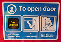
Example: Train door handles requiring passengers to lower the window
[/column][column width=”47%” padding=”6%”]
Specialised affordances
â– Design elements so that they can only be used in particular contexts or arrangements
â– Format lock-in is a subset of this: making elements (parts, files, etc) intentionally incompatible with those from other manufacturers; rarely user-friendly design

Example: The bevelled corner on SIM cards, memory cards and floppy disks ensures that they cannot be inserted the wrong way round
[/column][column width=”47%” padding=”0%”]
Partial self-correction
â– Design systems which partially correct errors made by the user, or suggest a different action, but allow the user to undo or ignore the self-correction — e.g. Google’s “Did you mean…?” feature
â– An alternative to full, automatic self-correction (which does not actually influence the user’s behaviour)
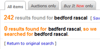
Example: eBay self-corrects search terms identified as likely misspellings or typos, but allows users the option to ignore the correction
[/column]
[column width=”47%” padding=”6%”]
Portions
â– Use the size of ‘portion’ to influence how much users consume: unit bias means that people will often perceive what they’re provided with as the ‘correct’ amount
â– Can also be used explicitly to control the amount users consume, by only releasing one portion at a time, e.g. with soap dispensers

Example: ‘Portion packs’ for snacks aim to provide customers with the ‘right’ amount of food to eat in one go
[/column][column width=”47%” padding=”0%”]
Conditional warnings
â– Detect and provide warning feedback (audible, visual, tactile) if a condition occurs which the user would benefit from fixing (e.g. upgrading a web browser), or if the user has performed actions in a non-ideal order
â– Doesn’t force the user to take action before proceeding, so not as ‘strong’ an errorproofing method as an interlock.
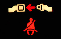
Example: A seatbelt warning light does not force the user to buckle up, unlike a seatbelt-ignition interlock.
[/column][end_columns]
Photos/screenshots by Dan Lockton except seatbelt warning image (composite of photos by Zoom Zoom and Reiver) and donor card photo by Adrienne Hart-Davis.