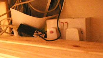
Seth Godin mentions providing a ‘convenience’ feature for customers and then intentionally making it inconvenient to use:
“Here at the White Plains airport, I’m noticing all these people doing things to me. Enforcing irrational rules. Intentionally putting the seats far from the electrical outlets so people like me won’t steal electricity. Yelling over the PA system. Scolding people for not standing in the right place.”
Whether, in the case he’s discussing, the electrical outlets really were positioned far from the seats to stop people plugging in laptops and so on, or whether the positioning of the seats and the outlets were entirely unconnected decisions (badly-positioned sockets aren’t exactly uncommon) my intuition tells me that there will be plenty of other examples where a ‘convenience’ feature is deliberately crippled or implemented in a way that restricts customers’ ability to use it. When it’s done for strategic reasons (appear better to customers, or just save money on electricity), it’s certainly an architecture of control.
Off the top of my head, free air pumps (tyre inflators) at petrol stations are often positioned in such a way that pays lip-service to the actual practice of using them: it looks good to have ‘free air’ but in many cases the placing of the pump makes it awkward to pull a car in satisfactorily to use it without significant manoeuvring*. That’s maybe a weak example: there must be better ones – any comments welcome!
*Of course, where the air pump requires payment, it never seems to run quite long enough to top up all four wheels, thus meaning you have to insert another coin. Whether that’s a deliberate trick, or simply a poorly planned timer, or my own sloth, I don’t know.
Pingback: WebWord » Blog Archive » Usability Tidbits for Monday 20-October-2006
Pingback: WebWord » Blog Archive » Terrible Electric Plug Positions Revisted