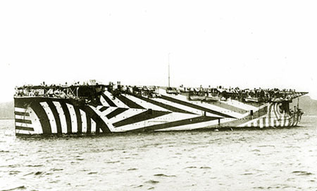
The dazzle painting of HMS Furious, c. 1918. Image from A Gallery of Dazzle-Painted Ships
A couple of weeks ago we looked at casino carpet design – a field where busy, garish graphic design is deliberately employed to repel viewers, and direct their attention somewhere else. Ben Hyde commented that deliberately unattractive “background music, lighting, seating, and color schemes in large malls” may be used to drive shoppers into the quieter surroundings of the actual stores, which certainly rings true in some cases I can think of.
On another level, though, A comment by Kenshi drew my attention to the dazzle camouflage used in the First World War, which is quite startling, in a brilliantly bold way. Roy R Behrens‘ book, False Colors: Art, Design and Modern Camouflage, from the website of which I’ve borrowed these images, looks extremely interesting, and I will certainly be ordering a copy when I have the budget.
Developed in Britain by Norman Wilkinson and in the US by Everett Warner and Frederic Waugh, the dazzle techniques were intended to make “a single thing appear to be a hodgepodge of unrelated components,” as Behrens puts it in this fascinating article. The aim was that such visual disruption would cause confusion and make it difficult for the enemy to identify what kind of ship – and what size – it was from a distance, with the use of ‘reversed perspective’ in the patterning a part of this. The ship’s course – and angle to the viewer – would also be problematic to identify, with colouring including bright whites, blues and sea-green alongside black, darker blue and grey selectively helping parts of the ship to blend into the seascape, and other parts very much stand out.
Breaking the enemy’s ability to distinguish elements of the ship properly, and generally to cause distraction and make it difficult to concentrate on observation for protracted periods, were all part of this plan; painting ships with different dazzle patterning on each side made identification even harder.
Despite being likened to Cubism disdainfully by some contemporary journalists, the processes used for designing the camouflage were developed both analytically and empirically, and extensively tested before being applied to the real vessels. Nevertheless, there are certainly elements in common between dazzle techniques and parts of Picasso’s and others’ work; Behrens has written further on the interactions between Cubism, Gestalt theory and camouflage (both in nature and man-made).
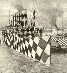
Left: The Mauritania in dazzle paint camouflage. Right: Those blue and white stripes are familiar to UK shoppers today. Images from A Gallery of Dazzle-Painted Ships
Intriguingly, the right-hand image above, with the bold blue and white stripes, has something in common with an everyday livery familiar to tens of millions of British shoppers: the iconic Tesco Value branding (below), at least in its original form. I’m not suggesting an actual link, but as we will see, there is something in common in the intentions behind these disparate methods of influencing viewer behaviour.
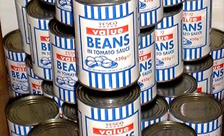
Tesco Value Beans. Image from Plap man on Flickr.
The same Tim Harford article quoted in my recent post about defaults suggests that the “infamously ugly” Tesco Value packaging is intended as a tool to facilitate price discrimination:
The difficulty is that if some of your products are cheap, you may lose money from customers who would willingly have paid more. So, businesses try to discourage their more lavish customers from trading down by making their cheap products look or sound unattractive, or, in the case of Starbucks, making the cheap product invisible. The British supermarket Tesco has a “value” line of products with infamously ugly packaging, not because good designers are unavailable but because the supermarket wants to scare away customers [from the Value products] who would willingly spend more [on other brands, or Tesco’s ‘normal’ private label products].
Whereas the dazzle camouflage was intended to confuse and disconcert the viewer, the thinking behind the Tesco Value graphics (I would love to know who designed the original style) thus appears to be to disconcert or repel certain viewers (customers) so that they pick a higher-priced alternative (usually on the shelf just above the Value items – Tesco’s planograms have thinking behind them), while allowing immediate segmentation – those customers looking for the cheapest products possible find the Value products easily.
There can’t be many retail situations where pretty much the same products can be sold successfully at two different prices on the same shelving unit just because of differing packaging graphics, but it seems to work for Tesco, in the process creating a significant meme.
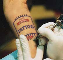
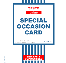
Left: a ‘Tesco Value’ tattoo, from this B3ta thread There have been many others. Right: Rich Boakes’ ‘Tesco Value’ greetings cards have been widely imitated, and could even have inspired this effort from Asda.
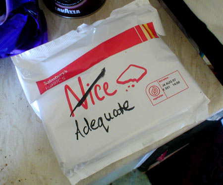
Updates to the Tesco Value branding in recent years have reduced the intensity of the blue stripes and brought the style closer to other supermarkets’ ‘value’ brands, which all tend to be similarly sparse (e.g. Sainsbury’s Basics, below), but the Tesco style is still the most distinctive.
6 Comments