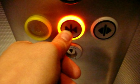
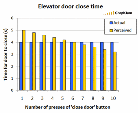
This is a great graph from GraphJam, by ‘Bloobeard’. It raises the question, of course, whether the ‘door close’ buttons on lifts/elevators really do actually do anything, or are simply there to ‘manage expectations‘ or act as a placebo.
The Straight Dope has quite a detailed answer from 1986:
The grim truth is that a significant percentage of the close-door buttons [CDB] in this world, for reasons that we will discuss anon, don’t do anything at all.
…
In the meantime, having consulted with various elevator repairmen, I would say that apparent CDB nonfunctionality may be explained by one of the following:(1) The button really does work, it’s just set on time delay.
Suppose the elevator is set so that the doors close automatically after five seconds. The close-door button can be set to close the doors after two or three seconds. The button may be operating properly when you push it, but because there’s still a delay, you don’t realize it.(2) The button is broken. Since a broken close-door button will not render the elevator inoperable and thus does not necessitate an emergency service call, it may remain unrepaired for weeks.
(3) The button has been disconnected, usually because the building owner received too many complaints from passengers who had somebody slam the doors on them.
(4) The button was never wired up in the first place. One repair type alleges that this accounts for the majority of cases.
Gizmodo, more recently, contends that:
…the Door Close button is there mostly to give passengers the illusion of control. In elevators built since the early ’90s. The button is only enabled in emergency situations with a key held by an authority.

This is clearly not always true; I’ve just tested the button in the lift down the corridor here at Brunel (installed around a year ago) and it works fine. So it would seem that enabling the functionality (or not) or modifying it (e.g. time delays) is a decision that can be made for each installation, along the lines of the Straight Dope information.
If there’s a likelihood (e.g. in a busy location) that people running towards a lift will become antagonised by those already inside pressing the button (deliberately or otherwise) and closing the door on them, maybe it’s sensible to disable it, or introduce a delay. If the installation’s in a sparsely populated corner of a building where there’s only likely to be one lift user at a time, it makes sense for the button to be functional. Or maybe for the doors to close more quickly, automatically.
But thinking about this more generally: how often are deceptive buttons/controls/options – deliberate false affordances – used strategically in interaction design? What other examples are there? Can it work when a majority of users ‘know’ that the affordance is false, or don’t believe it any more? Do people just give up believing after a while – the product has “cried Wolf” too many times?
Matt Webb (Mind Hacks, Schulze & Webb) has an extremely interesting discussion of the extinction burst in conditioning, which seems relevant here:
There’s a nice example I read, I don’t recall where, about elevators. Imagine you live on the 10th floor and you take the elevator up there. One day it stops working, but for a couple of weeks you enter the elevator, hit the button, wait a minute, and only then take the stairs. After a while, you’ll stop bothering to check whether the elevator’s working again–you’ll go straight for the stairs. That’s called extinction.
Here’s the thing. Just before you give up entirely, you’ll go through an extinction burst. You’ll walk into the elevator and mash all the buttons, hold them down, press them harder or repeatedly, just anything to see whether it works. If it doesn’t work, hey, you’re not going to try the elevator again.
But if it does work! If it does work then bang, you’re conditioned for life. That behaviour is burnt in.
I think this effect has a lot more importance in everyday interaction with products/systems/environments than we might realise at first – a kind of mild Cargo Cult effect – and designers ought to be aware of it. (There’s a lot more I’d like to investigate about this effect, and how it might be applied intentionally…)
We’ve looked before at the thermostat wars and the illusion of control in this kind of context. It’s related to the illusion of control psychological effect studied by Ellen Langer and others, where people are shown to believe they have some control over things they clearly don’t: in most cases, a button does afford us control, and we would rationally expect it to: an expectation does, presumably, build up that similar buttons will do similar things in all lifts we step into, and if we’re used to it not doing anything, we either no longer bother pressing it, or we still press it every time “on the off-chance that one of these days it’ll work”.
How those habits form can have a large effect on how the products are, ultimately, used, since they often shake out into something binary (you either do something or you don’t): if you got a bad result the first time you used the 30 degree ‘eco’ mode on your washing machine, you may not bother ever trying it again, on that machine or on any others. If pressing the door close button seems to work, that behaviour gets transferred to all lifts you use (and it takes some conscious ‘extinction’ to change it).
There’s no real conclusion to this post, other than that it’s worth investigating this subject further.
