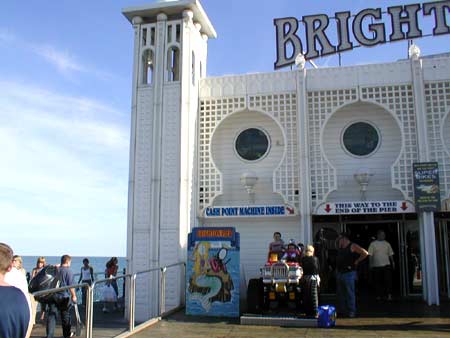


Deliberately routing users via a longer or more circuitous route is found in many forms (with a variety of intentions) from misleading road signs, to endless click-through screens, splitting up articles, periodic rearrangement of supermarket shelves, and so on. This kind of forcing function can also be used to increase the likelihood of users reading ‘important’ information; as always, there is an agenda behind the design decision.
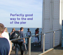
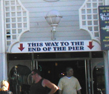
But it’s rare to see something quite as blatant as the above “This way to the end of the pier” sign on Brighton Palace Pier, attempting to persuade visitors to walk through the amusement arcade rather than along the walkways either side of the arcade. I don’t know how effective it is; conceivably some visitors might assume that it’s the only way to the end of the pier, but given how easy it is to see along the walkways either side, I’m not sure the deception is very convincing.
What’s the worst intentional mis-direction you’ve come across? And did it ‘work’?