Bonjour / Goeiendag to visitors from Design for Persuasion: while you’re here, you might also like to download a free poster [PDF] which has 12 of the Design with Intent patterns on it in a handy reference form. Thanks for stopping by!
The Security Lens represents a ‘security’ worldview, i.e. that undesired user behaviour is something to deter and/or prevent though ‘countermeasures’ designed into products, systems and environments, both physically and online, with examples such as digital rights management.
From a designer’s point of view, this can be an ‘unfriendly’ – and in some circumstances unethical – view to take, effectively treating users as ‘guilty until proven innocent’. However, thinking more closely about the patterns, it’s possible to think of ways that they could be applied to help users control their own habits or behaviour for their own benefit – encouraging exercise, reducing energy use, and so on.
Surveillance
“What do I do when other people might be watching?”
â– If people think others can see what they’re doing, they often change their behaviour in response, through guilt, fear of censure, embarrassment or another mechanism
â– Techniques range from monitoring users’ actions with reporting to authorities, to simpler ‘natural surveillance’, where the layout of an area allows everyone to see what each other is doing. Statistics making public details about users’ contributions to a fund might fit in here too. Surveillance can benefit the user where monitoring allows a desired intervention, e.g. a fall alarm for the elderly
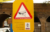
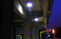
Examples: The ubiquitous CCTV–or the threat of it–and security lighting, are both intended to influence user behaviour, in terms of being a deterrent to crime in the first place
 This pattern is about constraining user behaviour.
Atmospherics
“I can’t hang around here with that racket going on”
â– Use (or removal) of ambient sensory effects (sound, light, smell, taste, etc) to influence user behaviour
â– Atmospherics can be ‘discriminatory’, i.e. targeted at particular classes of users, based on some characteristic enabling them to be singled out – such as the pink lights supposed to make teenagers with acne too embarrassed to hang around – or ‘blanket’, i.e. targeted at all users, e.g. Bitrex, a bitter substance, used to discourage drinking weedkiller or biting your nails.
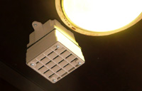
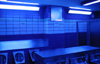
Examples: Two examples of ‘discriminatory’ atmospherics: the Mosquito emits a 17.4 kHz tone to drive away young people from public places; blue lighting is used in some public toilets to discourage drug injection by making veins difficult to see
This pattern is mainly about constraining user behaviour…
 but can also motivate a user, e.g. pleasant sensations such as the fresh bread smell used in supermarkets can encourage purchases.
[column width=”47%” padding=”6%”]
Threat of damage
“That’s going to hurt”
â– It’s not nice, but the threat of damage (or injury) lies behind many measures designed to influence behaviour, from tyre damage spikes to barbed wire, electric fences, shards of glass cemented into the top of walls, and so on.
â– In some cases the threat alone is hoped to be enough to dissuade particular behaviours; in others, it’s expected that some mild injury or discomfort will occur but put people off doing it again. Warnings are often used (and may be legally required), but this is not always the case.

Example: Various kinds of ‘skate stopper’ in public places, such as this so-called pig ear are designed to cause damage to skateboards (and injury to skateboarders) to dissuade them from skating an area.
[/column][column width=”47%” padding=”0%”]
What you have
“Insert passcard now”
â– ‘What you have’ relies on a user possessing a certain tool or device to enable functionality or gain access.
â– Aside from the obvious (keys, passcards, dongles and so on), there are, for example, specialised screwdrivers for security screws, which rely (largely unsuccessfully) on the distribution channels being kept private. Money itself could be seen as an example of this, especially where it’s intentionally restricted to influence behaviour (e.g. giving children a certain amount of pocket money to limit what they can buy.)
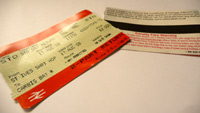
Example: When they’re actually checked, rail or other travel tickets restrict journeys to people who have the right ticket
[/column][column width=”47%” padding=”6%”]
What you know or can do
“Enter password”
â– ‘What you know or can do’ relies on the capabilities of users – some information or ability which only a subset of users can provide. The most obvious examples are passwords and exams (e.g. driving tests) – testing users’ knowledge / understanding before ‘allowing’ them to perform some behaviour. Often one capability stands as a proxy for another, e.g. CAPTCHAs separating humans from automated bots.
â– These are often interlocks – e.g. breathalyser interlocks on car ignitions, or, one stage further, the ‘puzzle’ interlocks tested during the 1970s, where a driver had to complete an electronic puzzle before the car would start, thus (potentially) catching tiredness or drug use as well as intoxication.
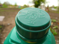
Example: Childproof lids on bottles of potentially dangerous substances – such as this weedkiller – help prevent access by children, but can also make it difficult for adults with limited dexterity.
[/column][column width=”47%” padding=”0%”]
Who you are
“If the glove fits…”
â– Design based on ‘who you are’ intends to allow or prevent behaviour based on some criteria innate to each individual or group – usually biometric – which can’t be acquired by others.
â– The aim is usually strong denial of access to anyone not authenticated, but there are also cases of primarily self-imposed ‘who you are’ security, such as the Mukurtu system, stamping ‘Confidential’ on documents, and so on.
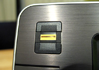
Example: Fingerprint scanners are becoming increasingly common on computer hardware.
[/column][column width=”47%” padding=”6%”]
What you’ve done
“Do 10 minutes more exercise to watch this show”
â– Systems which alter the options available to users based on their current / past behaviour are increasingly easy to imagine as the technology for logging and tracking actions becomes easier to include in products (see also Surveillance). Products which ration people’s use, or require some ‘work’ to achieve a goal, fit in here.
â– These could simply ‘lock out’ someone who has abused/misused a system (as happens with various anti-spam systems), or, more subtly, could divide users into classes based on their previous behaviour and provide different levels of functionality in the future.
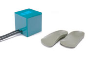
Example: Gillian Swan’s Square Eyes restricts children’s TV viewing time based on the amount of exercise they do (measured by these special insoles)
[/column][column width=”47%” padding=”0%”]
Where you are
“This function is disabled for your current location”
â– ‘Where you are’ security selectively restricts or allows a user functions based on a user’s location
â– Examples include buildings intended to have no mobile phone reception (perhaps ‘for security reasons’, or maybe for the benefit of other users, e.g. in a cinema), and IP address geographic filtering, where website users identified as being in different countries are given access to different content.
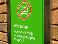
Example: Some supermarket trolleys have devices fitted to lock the wheels, mechanically or electronically when taken outside a defined area. Less high-tech versions have also been used!
[/column][end_columns]
Photos/screenshots by Dan Lockton except fingerprint scanner by Josh Bancroft and Square Eyes photo from Brunel University press office.
____________________
The Design with Intent Toolkit v0.9 by Dan Lockton, David Harrison and Neville A. Stanton
Introduction | Behaviour | Architectural lens | Errorproofing lens | Persuasive lens | Visual lens | Cognitive lens | Security lens