 Chris Vallance of Radio 4’s excellent iPM has done a thoughtful interview with Sir Clive Sinclair, ranging across many subjects, from personal flying machines to the Asus Eee, and touching on the subject of consumer understanding of technology, and the degree to which the public can engage with it:
Your [Chris Vallance’s] generation really understood the computers, and today’s generation know they’re just a tool, and don’t really get to grips with them… When I was starting in business, and when I was a child, electronics was a huge hobby, and you could buy components on the street and make all sort of things, and people did. But that also has all passed; it’s almost forgotten.
It’s true, of course, that there are still plenty of hobbyist-makers out there, including in disciplines that just weren’t open before, and if anything, initiatives such as Make and Instructables – and indeed the whole free software and open source movements – have helped raise the profile of making, hacking, modding and other democratic innovation. It’s no secret that Clive himself is a proponent of Linux and open source in general for future low-cost computing, as is mentioned briefly in the interview, and the impact of the ZX series in children’s bedrooms (together with BBC Micros at school) was, to some extent, a fantastic constructionist success for a generation in Britain.
But is Clive right? How many schoolkids nowadays make their own radios or burglar alarms or write their own games? When they do, is it a result of enlightened parents or self-directed inquisitiveness? Or are we guilty of applying our own measures of ‘engagement’ with technology? After all, you’re reading something published using WordPress, which was started by a teenager. Personally, I’m extremely optimistic that the future will lead to much greater technological democratisation, and hope to work, wherever possible, to contribute to achieving that.
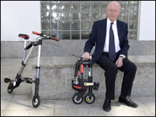
I’ve worked for Clive, as a designer/engineer, on and off, for a number of years, and it’s pleasing to have an intelligent media interview with him that doesn’t simply regurgitate and chortle over the C5, but instead tries to tap his vision and thoughts on technical society and its future.
Silicon Dreams
Incidentally, Clive’s 1984 speech to the US Congressional Clearinghouse on the Future, mentioned in the interview, is extremely interesting – quite apart from the almost Randian style of some of it – as much as for the mixture of what we might now see as mundanities among the far-sighted vision as for the prophetic clarity, with talk of guided 200mph maglev cars and the colonisation of the galaxy alongside the development of a cellular phone network and companion robots for the elderly. Of course, the future is here, it’s just not evenly distributed yet.
Talk of information technology may be misleading. It is true that one of the features of the coming years is a dramatic fall, perhaps by a factor of 100, in the cost of publishing as video disc technology replaces paper and this may be as significant as the invention of the written word and Caxton’s introduction of movable type.
Talk of information technology confuses an issue – it is used to mean people handling information rather than handling machines and there is little that is fundamental in this. The real revolution which is just starting is one of intelligence. Electronics is replacing man’s mind, just as steam replaced man’s muscle but the replacement of the slight intelligence employed on the production line is only the start.
And then there is this, which seems to predict electronic tagging of offenders:
Consider, for example, the imprisonment of offenders. Unless conducted with a biblical sense of retribution, this procedure attempts to reduce crime by deterrence and containment. It is, though, very expensive and the rate of recidivism lends little support to its curative properties.
Given a national telephone computer net such as I have described briefly, an alternative appears. Less than physically dangerous criminals could be fitted with tiny transporters so that their whereabouts, to a high degree of precision, could he monitored and recorded constantly. Should this raise fears of an Orwellian society we could offer miscreants the alternative of imprisonment. I am confident of the general preference.