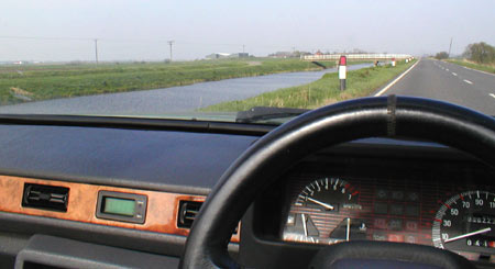
Speedometer, rev counter and fuel and temperature gauges on the dashboard of my 1992 Reliant Scimitar SST. Photo taken on B1098 alongside Sixteen Foot Drain, Isle of Ely, England.
In part 1 of ‘Shaping behaviour’, we took a look at ‘sticks and carrots’ as approaches for shaping (or changing) people’s behaviour. It’s especially worth reading and thinking about the comments on that post as there are some very thoughtful analyses which go beyond my rather cursory treatment. ‘Shaping behaviour’ is a vast field, encompassing pretty much all of politics, advertising and marketing alongside much of religion, education, psychology (and psychiatry?), product and graphic design.
The ‘sticks, carrots and speedometers’ classification was originally mentioned to me as a possible method by Chris Vanstone, of the UK Design Council’s former research arm, RED. The idea is that you can get people to change their behaviour by persuading (or forcing) them with ‘sticks’ (punishment/disincentives), ‘carrots’ (rewards) or ‘speedometers’ (showing them the results of their actions, how they’re doing, or how well they could be doing if they changed their behaviour). Having looked at sticks and carrots – and found the classification rather limiting – let’s take a look at speedometers.
Some gauges provide information which directly relates to a user’s actions at that time. An actual speedometer or rev counter allows the user to determine what effect his or her actions are having on a vehicle, and take corrective action if the information displayed is outside the ‘correct’ range (of course there are other factors, such as the resistance to motion from drag or going uphill, and if one can hear the engine, a rev counter’s perhaps not really necessary, but I digress). Other gauges, such as fuel or temperature gauges (see photo at top) show us information over which we can’t have so much direct influence (or, in the case of a clock, say, no influence…) but about which we need to take action if certain levels are reached. Certainly, we change our behaviour as a result of taking in the information displayed. Usually. And the speedometer can of course be a metaphor for other methods of feedback or information displays – which I’ll get to later on.
Energy use
Sticking with physical gauges for the moment, in recent times there’s been a lot of design effort put into devices which monitor and display our energy or fuel use, with the hope that they’ll persuade us to change our behaviour, or bring to our attention which devices (e.g. in a home) are more power-hungry than others in an immediately persuasive way. The Design Council’s Future Currents project, which investigated a range of interesting techniques and design approaches, put the idea well:
Energy is invisible, which makes it difficult to control. We can give people the tools to monitor their own energy use. Studies show that if people can see what they’re using, they use up to 15% less energy.
An anecdote in Kalle Lasn’s Design Anarchy claims an even larger reduction:
The manager of a housing co-op was increasingly frustrated with her tenants. No matter how much she reminded and badgered them… the tenants would not, could not reduce their energy consumption. Finally she hit an idea. What would happen, she wondered, if the electricity meters were moved from the basement to a conspicuous spot right beside the front door, so that each time the tenants left or entered their home, they could see how fast their meter was whirring? The meters were moved. Lo and behold, within a few weeks electricity consumption fell 30 percent.
(It’s not clear whether there were individual meters so tenants could see each other’s consumption – that kind of “control by embarrassment“, or social pressure, may be effective in this free-rider or unequal contribution situation.)
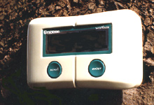
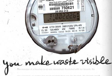
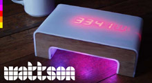


Above left: Wattbox by Gary Lockton, Brunel University, 1992, a simple unit which displayed the cost of electricity being used as well as estimated bills; Above right: ‘You make waste visible’ from Kalle Lasn’s Design Anarchy; Centre left: Wattson, from DIYKyoto; Centre right: An example ‘greenness gauge’ from the Design Council’s Future Currents project; Bottom left: Static! Flower Lamp ‘blooms’ when a household has reduced its power consumption for a period; Bottom right: Static! Power Aware Cord glows with an intensity related to the power being used. First image courtesy of Paul Turnock; other images from the websites linked.
The convergence of new monitoring and connectivity technologies such as home wireless networks and RFID, with the pressure to scrutinise our environmental impact, has meant that there are more opportunities for potentially persuasive, interesting ways of approaching this area. Tom Coates has some good thoughts on this, and the relation to continuous monitoring of other parts of our (and others’) lives, and how fascinating it can be. Wattson (thanks to both Richard Reynolds and Michelle Douglas for originally bringing this to my attention) takes an especially ‘designer’ approach, becoming a coffee-table talking point as well as showing (in different display modes) the power currently being used, the costs, and, via a coloured glow projected onto the table below, a non-numerical indication of the intensity of power usage. Similarly playful methods are used in some of the Static! projects from Stockholm’s Interactive Institute – perhaps, in fact, when the ‘event’ which occurs as the ‘speedometer’ registers more desirable values is exciting in itself, the technique is closer to a ‘carrot’ than a speedometer.

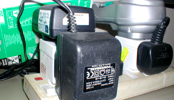
Left: The Energy Label, required on certain products/packaging in the EU; Right: A typical mess of adaptors powering home electronic equipment. Here we have a scanner, a power drill charger, a printer (plug hidden), a battery charger and a cutting plotter. How easy is it for a consumer to audit the power usage of this kind of mess?
The related debate over standby buttons on home electrical equipment which I covered briefly in July last year, brought home an important point to me, as someone who’s worked on quite a few consumer electronic products powered from adaptors: many users think that if a red LED is on when the product is ‘off’, that little LED is all that’s being powered. That’s quite an important issue when it comes to consumers having a better understanding of their home energy use.
When seeing the Wattson and Future Currents projects for the first time, I was tempted to say “well, why don’t people just look at the power ratings on the appliances they buy?” but soon realised that that’s a pretty entrenched engineering mindset rearing itself in my mind. People don’t want to have to look on a label on the back of the product. They mostly don’t think about energy use when buying products. Even the use of ‘green’ labelling on the front of products (e.g. the EU label shown above) doesn’t hit home the actual monetary costs of different devices over typical usage periods. In this sense, monitoring devices which really get the user interested in using products more efficiently do seem to be very much worth it, even when they themselves use more power than strictly ‘necessary’.
(There are a few points I’d like to make about home lighting and ‘energy saving’ light bulbs, especially since some aspects of the recent blogosphere commentary made me think a little further, but they can wait for another day…)
Economy gauges
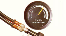
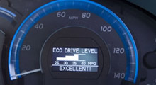
Left: A traditional analogue vacuum gauge showing ‘fuel economy’. Image from brochure for Reliant Rialto 2, 1984; Right: Toyota’s Eco Drive meter from the Camry – image from HybridCars.com. As an aside, I have no idea how 35-40 mpg can be considered ‘excellent’! What year is this?
Moving away from home electricity consumption, the increased prevalence of electronic in-car trip computers, usually built-in, has meant that second-by-second fuel economy read-outs are much more common, and can again inspire a kind of self-challenge to maximise economy while driving. As the miles-per-gallon (or perhaps L/100 km) figure drops (or increases) with every blip on the accelerator or rapid acceleration from the traffic lights, drivers really can train themselves to change their behaviour (indeed, I know a couple of people who are constantly shifting their gaze from the road ahead down to, alternately, the speedometer and the miles per gallon figure, to see “how well they are doing”, which is not necessarily ideal). Economy gauges in cars are nothing new – vacuum gauges were quite a popular home-fit accessory at one time, but they generally did not directly relate to the fuel consumption per distance travelled, merely the vacuum in the inlet manifold, hence the amount of fuel-air mixture being drawn through, whether or not the car were moving.
An alternative type of economy gauge was that once used by Volvo and other manufacturers, which compared the engine’s rpm (or the gearbox rpm?) to the gear selected (manual only, I presume) and illuminated a gearstick icon when the driver was in the ‘wrong’ gear, i.e. driving at less than optimum efficiency. Even more simply, some car companies used to mark the ‘gearchange points’ on the speedometer with dots at certain speeds – assuming the driver could not tell from the engine note that the gear engaged was too high or low, the dots would at least give some indication, though of course different driving conditions and loads would make the dots’ positions guidelines rather than absolutes. (I do have photographs of both these designs, somewhere, but will have to post them at some point in the future.)
Speedometers and control
Certainly, then, physical speedometers and gauges can have an effect on users’ behaviour and can encourage people to change; technology seems to be making this easier and more interesting and engaging. There are so many opportunities; already in some countries, there are roadside speed displays to make motorists aware of their speed (which present a fun challenge for drivers, or indeed cyclists, wanting to see what they can achieve) – how long before we have roadside CO2 monitoring (with displays)?
But are any of these ‘architectures of control’?
In the sense that they are methods of persuasion rather than methods of restriction or enforcement, they are on one side of a line with rigid control on the other, but when we look at techniques such as the “control by embarrassment“, or social pressure mentioned earlier, we can see that there is some kind of continuum related to how the information displayed by the speedometer (of whatever form) is used: if only you can see your personal energy usage habits within a house, you can make the choice whether or not to change your behaviour, but if the rest of your household can also see your habits, and see that you’re costing them unnecessary money, the pressure on you to change is much greater.
That, I think, is where the ‘control’ element comes in. Say that every household’s yearly carbon emissions (however this were to be calculated) were monitored. If the information were available to the householders, it may give them food for thought, and may inspire changing behaviour. If the information were available to the government, it may lead to taxation, and may lead to changing behaviour. If the information were legally required to be displayed on an illuminated sign outside the house, so neighbours could see who was “getting away with more carbon emissions”, it may (perhaps) lead to people changing behaviour too, or risk recriminations from the community, possibly worse than just social embarrassment. This last case is pretty much speedometer + blackmail, and I would say that that crosses the line to become control. If you want to fit in, and not be censured by others, you have to conform. That is an architecture of control, very much so, and hence we can see that speedometers, as with many other possible design elements, can be used as part of systems of control, but are not in themselves necessarily political. It’s the way they’re used that makes them, possibly, controversial.
The speedometer metaphor
Metaphorically, of course, a speedometer can be any method of making users aware of their behaviour, or the link between their behaviour and some other effect. Many of the examples studied and created by Stanford’s Captology / Persuasive Technology lab fall into this area, offering users feedback on their actions, or encouraging them to behave in a certain way (e.g. giving up smoking) through highlighting causal relationships.
But isn’t this, to some extent, what all persuasion is about, if we allow our ‘speedometer’ to have, in some situations, only two values (on/’good’ vs off/’bad’)? Everything ‘persuasive’, from advertising campaigns to counselling, is about saying “A is happening/not happening because you’re doing/not doing B; it will be better/stop happening if you stop/start doing C.” A speedometer is saying “You’re doing OK because this is the result of your actions” or “Look at the results of your actions – you need to change what you’re doing!”
Is it true, then to say that any situation where one entity (person/animal/plant) is trying to change the behaviour of another entity is resolved either by control (forcing the change in behaviour) or persuasion (inspiring the change in behaviour), or a combination of the two (e.g. by tricking the entity into changing behaviour)?
Or is that too simplistic?