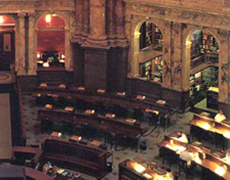
The Main Reading Room, Library of Congress. Image from CIRLA.
In this article from Communications of the ACM from January 2007, Russell Beale uses the term slanty design to describe “design that purposely reduces aspects of functionality or usability”:
It originated from an apocryphal story that some desks in the US Library of Congress in Washington, DC, are angled down toward the patron, with a glass panel over the wood, so when papers are being viewed, nothing harmful (like coffee cups, food and ink pens) can be put on top of them. This makes them less usable (from a user-centric point of view) but much more appropriate for their overall purpose.
…
[S]lanty design is useful when the system must address wider goals than the user might have, when, say, they wish to do something that in the grander scheme of things is less than desirable.
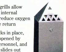

The angled lid on this cigarette bin prevents butts being placed on top; the cone shape of cup subtly discourages users from leaving it on the table.
We’ve looked before on this site at a couple of literally ‘slanty’ examples – notably, cigarette bins with angled lids and paper cone cups (above) – and indeed “the common technique of architects to use inclined planes to prevent people from leaving things, such as coffee cups, on flat spaces” is noted on the Designweenie blog here – but in his article, Beale expands the scope of the term to encompass interfaces or interaction methods designed to prevent or discourage certain user behaviour, for strategic reasons: in essence, what I’ve tried to corral under the heading ‘architectures of control‘ for the last few years, but with a different way of arriving at the idea:
We need more than usability to make things work properly. Design is (or should be) a conversation between users and design experts and between desired outcomes and unwanted side effects… [U]ser-centred design is grounded in the user’s current behavior, which is often less than optimal.
…
Slanty design incorporates the broader message, making it difficult for users to do unwanted things, as well as easy to do wanted things. Designers need to design for user non-goals – the things users do not want to do or should not be able to do even if they want to [my emphases]. If usability is about making it easy for users to do what they must do, then we need to have anti-usability as well well, making it difficult for them to do the things we may not want them to do.
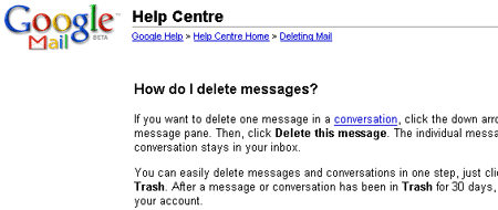
He gives the example of Gmail (below), where Google has (or had – the process is apprently not so difficult now) made it difficult for users to delete email – “Because Google uses your body of email to mine for information it uses to target the ads it delivers to generate revenue; indeed, deleting it would be detrimental to the service” but that in fact, this strategy might be beneficial for the user – “By providing a large amount of storage space for free, Gmail reduces any resource pressure, and by making the deletion process difficult it tries to re-educate us to a new way of operating, which also happens to achieve Google’s own wider business goals.” This is an interesting way of looking at it, and somewhat reminscent of the debate on deleting an Amazon or eBay account – see also Victor Lombardi’s commentary on the where the balance lies.
However, from my point of view, if there’s one thing which has become very clear from investigating architectures of control in products, systems and environments, it’s that the two goals Beale mentions – “things users do not want to do” and things users “should not be able to do” – only coincide in a few cases, and with a few products, and a few types of user. Most poka-yoke examples would seem to be a good fit, as would many of the design methods for making it easier to save energy on which my PhD is focusing, but outside these areas, there are an awful lot of examples where, in general, the goal of the user conflicts with the goal of the designer/manufacturer/service provider/regulator/authority, and it’s the user’s ability which is sacrificed in order to enforce or encourage behaviour in line with what the ‘other’ party wants. “No-one wakes up in the morning wanting to do less with his or her stuff,” as Cory Doctorow puts it.
Beale does recognise that conflicts may occur – “identify wider goals being pursued by other stakeholders, including where they conflict with individual goals” – and that an attempt should be made to resolve them, but – personally – I think an emphasis on using ‘slanty’ techniques to assist the user (and assist the ‘other party’, whether directly or simply through improving customer satisfaction/recommendation) would be a better direction for ‘slanty design’ to orient itself.
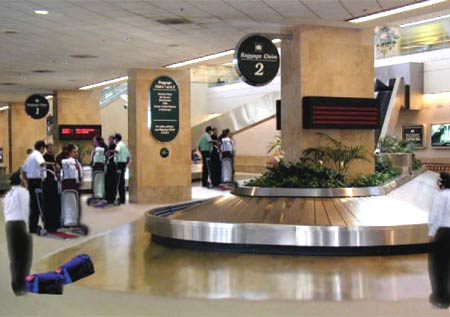
“Slanty-designed baggage carousel. Sloping floor keeps the area clear”. From ‘Slanty Design’ article by Russell Beale.
Indeed, it is this aim of helping individual users while also helping the supersystem (and actually using a slant, in fact) which informs a great suggestion on which Beale elaborates, airport baggage carousels with a slanted floor (above):
The scrum of trolleys around a typical [carousel] makes it practically impossible to grab a bag when it finally emerges. A number of approaches have been tried. Big signs… a boundary line… a wide strip of brightly coloured floor tiles…
My slanty design would put a ramp of about 30 degrees extending two meters or so up toward the belt… It would be uncomfortable to stand on, and trolleys would not stay there easily, tending to roll off backward or at least be awkward to handle. I might also add a small dip that would catch the front wheels, making it even more difficult to get the trolley or any other wheeled baggage on it in the first place, but not enough to trip up a person.
If I was being really slanty, I’d also incorporate 2 cm-high bristles in the surface, making it a real pain for the trolleys on it and not too comfy for the passengers to stay there either. Much easier for people to remain (with their trolleys) on the flat floor than negotiate my awkward hill. We’d retain the space we need, yet we could manage the short dash forward, up the hill, to grab our bags, then return to our trolleys, clearing the way for the next baggage-hungry passenger.
There are some very interesting ideas embodied in this example – I’m not sure that using bristles on such a slope would be especially easy for wheelchair users, but the overall idea of helping both the individual user, and the collective (and probably the airport authority too: reducing passenger frustration and necessity for supervision of the carousel), is very much something which this kind of design, carefully thought out, can bring about.
Pingback: Slanted and enchanted – Michael Alan Miller
Pingback: Slanty Design: Gjør det vanskelig for brukere | Kuttisme: internettmarkedsføring, sosiale medier, webanalyse, webdesign og webutvikling