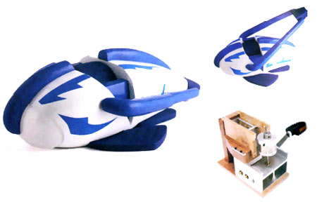
Main image and above right: Snowdown aesthetic model; below right: Snowdown functional test rig prototype.
Snowdown, by Matthew Barnett, is fantastic. Powered by a child exercising, moving the handle, it crushes ice cubes and compacts them to make snowballs. There are a lot of kids out there who would very much like one of these, at any time of year – summer especially. Shown last month at Made in Brunel – I hope Matthew finds a way to take the project forward.
Is the requiring-exercise-to-get-a-reward strategy an architecture of control? I think so, and I think this product exemplifies why and how it is possible to use ‘control’ for the benefit of the user. Sure, society benefits when children grow up more healthily, but the children (and their parents) also benefit. And Snowdown actively rewards the user for his or her effort.
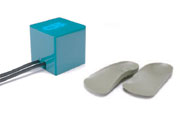
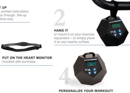
We’ve seen this thinking, specifically regarding encouraging exercise, embodied before on the blog in two products, as far as I can remember: Gillian Swan’s Square-Eyes (also from Brunel), and, of course, the Entertrainer. Both of these use television as the ‘reward’ for exercise – in the case of Square-Eyes, 100 steps on the special insole equate to 1 minute of TV time (controlled by a base station); with the Entertrainer, the user’s heart rate is monitored (you can set the level of exercise you want) and the TV’s volume is controlled, which is an interesting concept: you exercise watching the TV, keeping your heart rate within the optimal range:
The chest strap heart monitor wirelessly relays your heart rate to the Entertrainerâ„¢. The Entertrainer then determines if your heart rate is within, above, or below your target zone. If your heart rate is low, the Entertrainer lowers the volume on your television (or other infrared remotely controlled device). If your heart rate is within the target zone (range), the volume remains at a comfortable level. If your heart rate is too high, the volume increases.
Stanford’s Captology research group has also investigated exercise-promotion persuasive technology extensively (e.g. here) but I’m not sure to what extent actual ‘control’ is involved, as opposed to persuasion through making exercise more attractive/fun.


Square-Eyes by Gillian Swan, using special insoles and a control unit

The Entertrainer (image from theentertrainer.com)
Nevertheless, with all the above examples, the element of control is very much something the user opts into (unless, say, parents were to force their kids to use Square-Eyes or have no TV) rather than having it imposed with no choice. The ‘code’ is embedded in the product architecture, but you make a choice to use the product because you want the discipline it can help give you.
And again, Snowdown stands out, since it is something fun in itself. Indeed, it may be stretching it to see it as any more a control example than any other children’s toy which requires exercise (bicycle, trampoline, rollerskates, etc). If I hadn’t seen Matthew’s description which specifically highlighted the product’s ability to promote exercise in children, I probably wouldn’t have considered it in this light at all. And it’s perhaps this ‘mindless margin’ (to quote Brian Wansink) of helping yourself while not feeling that you’re being ‘controlled’, which might lie behind positive, successful, ethical, useful applications of architectures of control in design as opposed to the generally anti-user spirit with which the majority are imbued.